
Introduction
In most mobile application development, we have to repeat a particular UI with different content or data, e.g., e-commerce apps. Though using a ListView for this scenario is easy and familiar, you will have very limited flexibility in the UI.
If you are a Xamarin.Forms developer, you should already know about or have worked with StackLayout, Grid, FlexLayout, AbsoulteLayout, and RelativeLayout. These layouts provide an enormous amount of flexibility in achieving all kinds of UIs in mobile applications. However, we do not have the flexibility to provide real-time data to these UIs. This is because we have to create each child for these layouts and then bind its respective data. This process is very tedious since we may need to tweak the UI for every change in the data source.
To overcome this, Xamarin.Forms 3.5 introduced a new approach called Bindable Layouts, which works with all the previously mentioned layouts. By simply setting the ItemTemplate and ItemsSource, bindable layouts will create a UI (for the given ItemTemplate) for every data in the ItemsSource and add it as a child.
How to implement BindableLayout
BindableLayout has a set of attached properties for layouts derived from Layout<T>. Layouts like StackLayout, Grid, FlexLayout, AbsoulteLayout, and RelativeLayout are derived from Layout<T> and therefore can be used with BindableLayout. The properties are:
- ItemsSource – Data for the layout.
- ItemTemplate – UI for displaying the data in ItemsSource.
- ItemTemplateSelector – Run time template selector which can be switched based on the data.
In the following code, I have a simple label as an ItemTemplate for the StackLayout. When we set ItemsSource for the StackLayout, BindableLayout will create the number of labels based on the number of data and add them as children of the StackLayout.
C#
    public class ViewModel
    {
        public ViewModel()
        {
            Data = new ObservableCollection()<Model> {
                new Model { Text = "Pink", Color = Color.DeepPink },
                new Model { Text = "Crimson", Color = Color.Crimson },
                new Model { Text = "Aqua", Color = Color.Aqua },
                new Model { Text = "Blue", Color = Color.DeepSkyBlue },
                new Model { Text = "BurlyWood", Color = Color.BurlyWood }, };
        }

        public ObservableCollection<Model> Data { get; set; }
    }

    public class Model
    {
        public Color Color { get; set; }
        public string Text { get; set; }
    }
XAML
    <StackLayout BindableLayout.ItemsSource="{Binding Data}">
        <BindableLayout.ItemTemplate>
            <DataTemplate>
                <Label BackgroundColor="{Binding Color}"
                       Text="{Binding Text}"
                       FontAttributes="Italic"
                       FontSize="20"
                       VerticalTextAlignment="Center"
                       HorizontalTextAlignment="Center"
                       HeightRequest="105"
                       Margin="25" />
            </DataTemplate>
        </BindableLayout.ItemTemplate>
    </StackLayout>
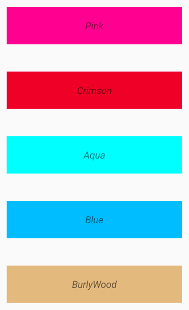
Stack layout as bindable layout
Bindable layouts in Syncfusion controls
Similar to the framework controls derived from Layout<T>, the following Syncfusion components support bindable layouts:
Accordion
The Accordion control allows content to be organized in a vertically stacked list of items that are collapsible. You can expand each item to reveal the content associated with that item. Moreover, it allows you to keep one item or multiple items in an expanded state at the same time.
In the following example, I am populating the Accordion by setting the ItemsSource and ItemTemplate of type AccordionItem, which has a header and content.
XAML
        <accordion:SfAccordion x:Name="accordion" BindableLayout.ItemsSource="{Binding AccordionData}" HeaderIconPosition="Start">
            <BindableLayout.ItemTemplate>
                <DataTemplate>
                    <accordion:AccordionItem>
                        <accordion:AccordionItem.Header>
                            <Grid Padding="10">
                                <Label HeightRequest="50"
                                       Text="{Binding Header}"
                                       TextColor="#495F6E"
                                       VerticalTextAlignment="Center" />
                            </Grid>
                        </accordion:AccordionItem.Header>
                        <accordion:AccordionItem.Content>
                            <Grid Padding="10" BackgroundColor="#FFFFFF">
                                <Label HeightRequest="50"
                                       Text="{Binding Content}"
                                       TextColor="#303030"
                                       VerticalTextAlignment="Center" />
                            </Grid>
                        </accordion:AccordionItem.Content>
                    </accordion:AccordionItem>
                </DataTemplate>
            </BindableLayout.ItemTemplate>
        </accordion:SfAccordion>

Accordion as bindable layout
Cards
Our Card layout is a layout control that accepts cards as children and arranges them in a stack where one card is visible at a time until you swipe to see the next card.
In the following example, I am populating the Card layout with multiple cards by simply setting the ItemsSource and ItemTemplate of type SfCardView.
XAML
    <cards:SfCardLayout WidthRequest="300"
                        HeightRequest="300"
                        BackgroundColor="#F0F0F0"
                        BindableLayout.ItemsSource="{Binding Data}"
                        SwipeDirection="Left"
                        VerticalOptions="Center">
        <BindableLayout.ItemTemplate>
            <DataTemplate>
                <cards:SfCardView BackgroundColor="{Binding}">
                    <StackLayout Orientation="Vertical">
                        <Image Source="{Binding Image}" ..... />
                        <Label Text="{Binding Text}"
                               VerticalTextAlignment="Center"
                               HorizontalOptions="CenterAndExpand" ..... />
                    </StackLayout>
                </cards:SfCardView>
            </DataTemplate>
        </BindableLayout.ItemTemplate>
    </cards:SfCardLayout>
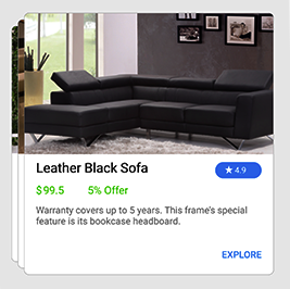
Card layout as bindable layout
Radio Button Group
Radio Button Group is a selection control that allows you to select one option from a list of predefined choices.
In the following example, I am populating the Radio Button group by setting the ItemsSource and ItemTemplate of type SfRadioButton.
XAML
        <syncfusion:SfRadioGroup x:Name="radioGroup"
                                 BindableLayout.ItemsSource="{Binding RadioGroupData}"
                                 HorizontalOptions="Center"
                                 VerticalOptions="Center">
            <BindableLayout.ItemTemplate>
                <DataTemplate>
                    <syncfusion:SfRadioButton x:Name="male"
                                              IsChecked="True"
                                              Text="{Binding Text}" />
                </DataTemplate>
            </BindableLayout.ItemTemplate>
        </syncfusion:SfRadioGroup>
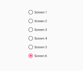
Radio group as bindable layout
Currently, we provide bindable layout support for the previously mentioned components. We will extend this support for upcoming components that would benefit from bindable layout support.
Conclusion
In this blog post, we walked through working with bindable layouts and their support in Syncfusion components such as Accordion, Cards, and Radio Button. We invite you to check out our ever-growing collection of Xamarin.Forms components. Please find the complete documentation for all the features here.
You can always download our free evaluation to see all these components in action. Also, explore our samples available in this GitHub repository. Ready to evaluate samples are available on Google Play and Microsoft Store.
If you have any questions or require clarification, please let us know in the comments section below. You can also contact us through our support forum, Direct-Trac, or our Feedback Portal. As always, we are happy to assist you!