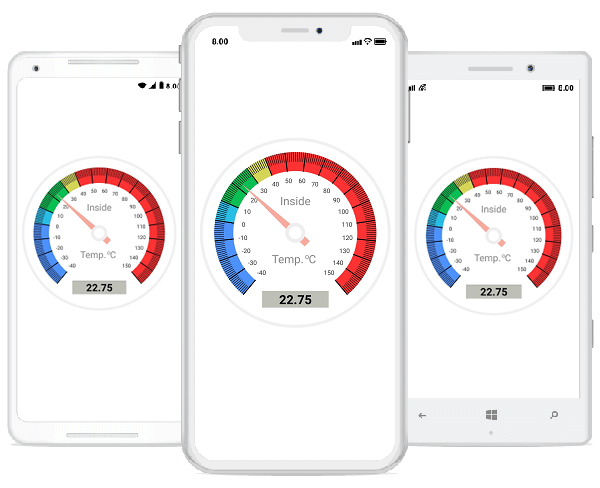
This is another overview series blog in which you are going to get a quick overview of our circular gauge and its features through designing a temperature monitor gauge.
The circular gauge is a data visualization component that helps you visualize numerical values on a circular scale. It has highly customizable features, such as scales, pointers, ranges, and annotations, and allows you to design a dashboard, clock, temperature monitor, speedometer, etc.
To create a temperature monitor, you need the following features in the circular gauge control:
- Scales—Define the temperature scale values in numbers from start to end with tick marks. Also used to draw the rim around the gauge.
- Ranges—Indicate multiple-colored temperature range levels.
- Pointers—Point out the current temperature value.Headers—Display header text.
- Annotations—Show the current temperature value.
This section explains how to design a temperature monitor by customizing the appearance of the circular gauge as shown in the following screenshot.
Configuring circular gauge
Launching circular gauge on each platform
iOS project
public override bool FinishedLaunching(UIApplication app, NSDictionary options)
{
    ...
        LoadApplication(new App());
        new Syncfusion.SfGauge.XForms.iOS.SfGaugeRenderer();
    ...
}
UWP project
To launch the circular gauge in UWP, create an instance of SfGaugeRenderer in the constructor of MainPage in the UWP project as shown in the following code.
public MainPage()
{
   ...
        new Syncfusion.SfGauge.XForms.UWP.SfGaugeRenderer();
    ...
}
Creating a circular gauge
- Import the following circular gauge control namespace in the XAML page.
<ContentPage
>
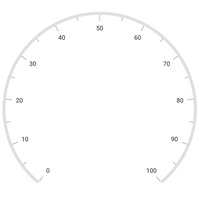
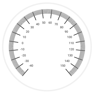
- Create an instance of the circular gauge class and add it to the layout that suits your requirements. The following screenshot depicts the default view of circular gauge when initializing the control.
<ContentPage     x_class="GuageOverview.MainPage">
    <gauge:SfCircularGauge></gauge:SfCircularGauge>
</ContentPage>
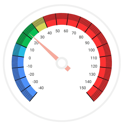
Scales
Scales contain a collection of scale elements, and you can add any number of circular scales inside the gauge. Scale contains labels and tick marks, the positions and values of which can be customized.
In the temperature monitor, two types of scale elements have been created; one is used to draw the rim around the circular gauge and the other to display temperature labels in numbers from -40 to 150 with tick marks. First, we should create an instance for scale objects and add it to the scales collection in circular gauge.
Scales have two types of tick marks: major and minor ticks. Major ticks have labels and are used to specify the primary value intervals. Minor ticks do not have labels and are used to define the space inside the primary value interval. You can specify the tick’s appearance and position-related properties using the MajorTickSettings and MinorTickSettings properties for scale.
Intervals of label and major ticks can be customized by using the Interval property. Minor ticks can be chosen per interval in scale using the MinorTicksPerInterval property.
You can define the start and end angles of a scale using the StartAngle and SweepAngle properties. The start and end values of the scale can be defined using the StartValue and EndValue properties. The default values of start angle and sweep angle are 130 and 280, and the default values of the start value and end value are 0 and 100.
Customize the position for the scale, ticks, and labels by using corresponding offset properties. Values for offset should be given from 0 to 1 (gauge center position to edge).
<gauge:SfCircularGauge Margin="20">
    <gauge:SfCircularGauge.Scales>
            <gauge:Scale ShowRim="True" ScaleStartOffset="1" RimThickness="2"  RimColor="#f2f1f1" ShowLabels="False" ShowTicks="False" StartAngle="0"  SweepAngle="360" />
            <gauge:Scale ShowRim="False"  StartValue="-40" EndValue="150" LabelOffset="0.55" Interval="10" MinorTicksPerInterval="9">
                <gauge:Scale.MajorTickSettings>
                    <gauge:TickSettings Color="Black" StartOffset="0.85" EndOffset="0.65" Thickness="2"/>
                </gauge:Scale.MajorTickSettings>
                <gauge:Scale.MinorTickSettings>
                    <gauge:TickSettings Color="Black" StartOffset="0.85" EndOffset="0.75" Thickness="1"/>
                </gauge:Scale.MinorTickSettings>
        </gauge:Scale>
    </gauge:SfCircularGauge.Scales>
</gauge:SfCircularGauge>
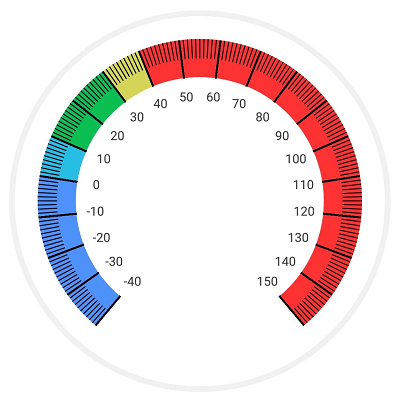
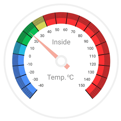
Ranges
Ranges contain a collection of range elements. You can add any number of ranges inside the scale. A range of the circular gauge is a visual element that helps you visualize where a value falls on a circular scale.
Ranges in a circular gauge are used to display a temperature range with different color indication. To design the temperature monitor, you should use five ranges for scale to indicate the various levels of temperature.
Every range has start and end values, and these can be specified using the StartValue and EndValue properties.
The length and position of a range can be customized using the outer and inner offset properties as shown in the following code. The outer offset properties are used where the range length starts in scale, and inner offset properties are used where the range length ends.
<gauge:Scale.Ranges>
         <gauge:Range StartValue="-40" EndValue="0" Color="#4f91fa" OuterStartOffset="0.85" OuterEndOffset="0.85" InnerStartOffset="0.65" InnerEndOffset="0.65" />
         <gauge:Range StartValue="0" EndValue="10" Color="#28bce4" OuterStartOffset="0.85" OuterEndOffset="0.85" InnerStartOffset="0.65" InnerEndOffset="0.65" />
         <gauge:Range StartValue="10" EndValue="30" Color="#0bbe53" OuterStartOffset="0.85" OuterEndOffset="0.85" InnerStartOffset="0.65" InnerEndOffset="0.65" />
         <gauge:Range StartValue="30" EndValue="40" Color="#d4d459" OuterStartOffset="0.85" OuterEndOffset="0.85" InnerStartOffset="0.65" InnerEndOffset="0.65" />
         <gauge:Range StartValue="40" EndValue="150" Color="#ff3233" OuterStartOffset="0.85" OuterEndOffset="0.85" InnerStartOffset="0.65" InnerEndOffset="0.65" />
</gauge:Scale.Ranges>
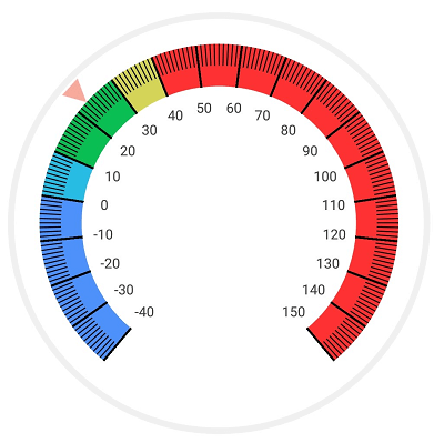
Pointers
Pointers contain a collection of pointer elements, and you can add any number of pointers inside the scale. Pointers are used to design the value indication symbol and point out the current temperature value in a temperature monitor.
There are three types of pointers available in gauge: range pointer, needle pointer, and marker pointer. The value of pointer is set by using the Value property.
A marker pointer is used to point out a value with built-in shapes, such as a triangle, inverted triangle, square, diamond, or image.
<gauge:Scale.Pointers>
      <gauge:MarkerPointer MarkerShape="InvertedTriangle" Color="#f7ab9c" Value="22.75" MarkerHeight="20" MarkerWidth="20" Offset="0.85" />
</gauge:Scale.Pointers>
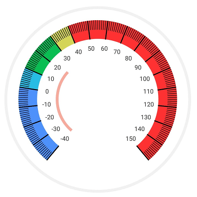
A range pointer is used to point out the value from the start value of the scale. The length and position of a range can be customized by using the StartOffset and EndOffset properties.
<gauge:Scale.Pointers>
        <gauge:RangePointer Value="22.75" StartOffset="0.45" EndOffset="0.42" Color="#f7ab9c"/>
</gauge:Scale.Pointers>
A needle pointer is used to point out a value with a highly customizable needle-type element. One end of the needle is positioned at the center of the scale and other end is pointing to the scale value.
The knob (rounded ball on the arrow) and tail (rectangle at the end of the knob) elements in needle pointer are used to enhance the pointer’s look. The length of a pointer can be customized using the LengthFactor property.
<gauge:Scale.Pointers >
          <gauge:NeedlePointer x_Name="pointer" Color="#f7ab9c" Value="22.75" TailLengthFactor="0.19" TailColor="#f7ab9c"  Thickness="8" KnobRadius="16" KnobStrokeColor="#efefef" KnobColor="White" KnobStrokeWidth="7" LengthFactor="0.77" >
          </gauge:NeedlePointer>
</gauge:Scale.Pointers >
Headers
Headers contain a collection of headers, and you can add any number of headers inside the circular gauge. You can display the text of “Inside,” “Temp,” and “Celsius” using the header support. The position of the text can be customized by using the Position property.
<gauge:SfCircularGauge.Headers>
            <gauge:Header Text="Inside" TextSize="22" ForegroundColor="#929292" Position="0.5,0.325" />
            <gauge:Header Text="Temp." TextSize="22" ForegroundColor="#929292" Position="0.46,0.63" />
            <gauge:Header Text="C" ForegroundColor="#929292" TextSize="22"  Position="0.59, 0.63"/>
            <gauge:Header Text="o" ForegroundColor="#929292" TextSize="14" Position="0.562,0.62"/>
 </gauge:SfCircularGauge.Headers>
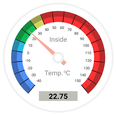
Annotation
Annotations contain a collection of annotation elements, and you can add any number of annotations inside the circular gauge. Annotations display metadata about a circular gauge at a specific point of interest in the plotting area. They provide options to add any view element, image, or text on the gauge.
To display the current pointer value in the temperature monitor, use annotation support to display the text value over the circular gauge. You can simply bind the current temperature point value to annotation label text.
The position of annotations can be customized using the Offset and Angle properties. The Offset property is used to move the annotation from the center to the required distance, whereas the Angle property places the annotation with respective angle direction.
<gauge:SfCircularGauge.Annotations>
            <gauge:GaugeAnnotation Offset="0.7" Angle="90" >
                <gauge:GaugeAnnotation.View>
                    <Label HorizontalTextAlignment="Center"  VerticalTextAlignment="Center" WidthRequest="130"  Text="{Binding Value, Source={Reference pointer}}"  BackgroundColor="#bebfb7" FontSize="22" FontAttributes="Bold" TextColor="Black" />
                </gauge:GaugeAnnotation.View>
            </gauge:GaugeAnnotation>
 </gauge:SfCircularGauge.Annotations>
Conclusion
Syncfusion’s circular gauge control for Xamarin.Forms has been designed with flexible UI customization to adapt to your app easily. It includes developer-friendly APIs to increase developers’ productivity. This control is also available for Xamarin.Android and Xamarin.iOS platforms.
Feel free to visit the circular gauge’s feature tour and documentation to learn more about its features and APIs. Also be sure to check out the complete sample, which is readily runnable, and see just how easy it is to create and configure the circular gauge.
If you have any questions or need clarification, please let us know in the comments section. You can also contact us through our support forum or Direct-Trac. We are happy to assist you!