Introduction
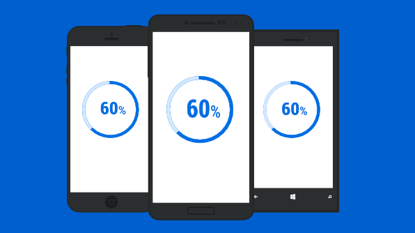
Welcome to a quick walk-through of Syncfusion’s progress bar control for Xamarin.Forms. The progress bar provides a visual indication of the progress of a lengthy task, such as a file download from a website. It includes features such as rectangular and circular bar shapes, determinate and indeterminate states, segmented progress visualization, customized range colors, and animations.
In this blog, you will learn how to add a progress bar into your application and customize its appearance.
Configure the progress bar
Syncfusion Xamarin components are available on nuget.org. The progress bar NuGet package must be installed to add the progress bar to your project. To do so, open Tools > NuGet package manager > Manage NuGet Packages for Solution in Visual Studio, and search for Syncfusion.Xamarin.SfProgressBar. Install the package.
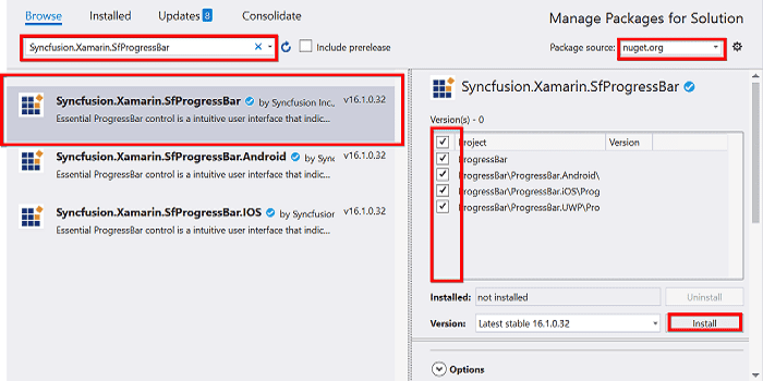
Installing the Progress Bar NuGet Package
Initialize the progress bar
The following steps explain how to initialize the progress bar control.
1. Import the progress bar namespace in the appropriate page as shown in the following code.
2. There are two variants of the progress bar: SfLinearProgressBar and SfCircularProgressBar. These render the progress on a rectangle or circular range, respectively. Add whichever you prefer to your page.
<!--Using linear progress bar-->
<progressBar:SfLinearProgressBar Progress="75"/>
<!--Using circular progress bar-->
<progressBar:SfCircularProgressBar Progress="75"/>
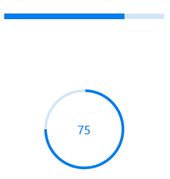
Linear and Circular Progress Bars
Launching the application on each platform with progress bar
To use the progress bar inside an application, each platform application requires some additional configuration. The configurations vary from platform to platform and are discussed in the following sections.
iOS
To launch the progress bar in iOS, call the SfLinearProgressBarRenderer.Init() or SfCircularProgressBarRenderer.Init() in the FinishedLaunching overridden method of the AppDelegate class after the Xamarin.Forms framework has been initialized and before the LoadApplication is called, as demonstrated in the following code sample.
public override bool FinishedLaunching(UIApplication app, NSDictionary options)
{
   …
   global::Xamarin.Forms.Forms.Init();
   // Add the following line if you are using SfLinearProgressBar.
   Syncfusion.XForms.iOS.ProgressBar.SfLinearProgressBarRenderer.Init();
   // Add the following line if you are using SfCircularProgressBar.
   Syncfusion.XForms.iOS.ProgressBar.SfCircularProgressBarRenderer.Init();
   LoadApplication(new App());
   …
}
Universal Windows Platform (UWP)
To launch the progress bar in UWP, initialize the SfLinearProgressRenderer() or SfCircularProgressBarRenderer() in the MainPage constructor before the LoadApplication is called, as demonstrated in the following code sample.
public MainPage()
{
   …
   // Add the following line if you are using SfLinearProgressBar.
   new Syncfusion.XForms.UWP.ProgressBar.SfLinearProgressRenderer();
   // Add the following line if you are using SfCircularProgressBar.
   new Syncfusion.XForms.UWP.ProgressBar.SfCircularProgressBarRenderer();
   LoadApplication (new App ());
   …
}
In addition to these configurations, initialize the progress bar assemblies in the App.xaml.cs file in your UWP project as shown in the following code sample. They are required to deploy the application with the progress bar in Release mode in the UWP platform.
// In App.xaml.cs
protected override void OnLaunched(LaunchActivatedEventArgs e)
{
   …
   if (rootFrame == null)
   {
      List assembliesToInclude = new List();
      // Add the following line if you are using SfLinearProgressBar.
 assembliesToInclude.Add(typeof(Syncfusion.XForms.UWP.ProgressBar.SfLinearProgressRenderer).GetTypeInfo().Assembly);

     // Add the following line if you are using SfCircularProgressBar.
 assembliesToInclude.Add(typeof(Syncfusion.XForms.UWP.ProgressBar.SfCircularProgressBarRenderer).GetTypeInfo().Assembly);
      Xamarin.Forms.Forms.Init(e, assembliesToInclude);
   }
   …
}
Android
The Android platform does not require any additional configuration to render the progress bar.
States
Based on the progress estimation, you can configure the progress bar’s two states:
- Determinate: This is the default state. You can use it when the progress can be estimated.
- Indeterminate: By enabling the IsIndeterminate property, you can change the progress bar state to indeterminate when the progress cannot be estimated or is not being calculated. It can be combined with the determinate mode to let users know that the app is estimating the progress before the actual progress starts.
<!--Using linear progress bar-->
<progressBar:SfLinearProgressBar  x_Name="LinearProgressBar" IsIndeterminate="True" />
<!--Using circular progress bar-->
<progressBar:SfCircularProgressBar x_Name="CircularProgressBar" IsIndeterminate="True" />
// Using linear progress bar.
this.LinearProgressBar.IsIndeterminate = true;
// Using circular progress bar.
this.CircularProgressBar.IsIndeterminate = true;
An optional feature of the determinate state is the buffer. This state allows you to visualize the secondary task progress using a secondary progress indicator when the primary task depends on the secondary task.
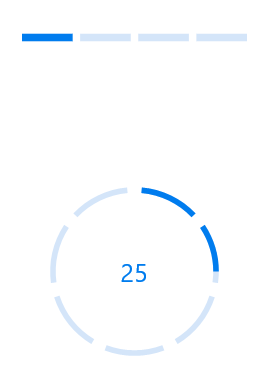
<progressBar:SfLinearProgressBar x_Name="LinearProgressBar" Progress="25" SecondaryProgress="75"> </progressBar:SfLinearProgressBar>
this.LinearProgressBar.Progress = 25;
this.LinearProgressBar.SecondaryProgress = 75;

Progress Bar with Buffer State
Segments
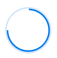
To visualize the progress of multiple sequential tasks, a progress bar can be divided into multiple segments using the SegmentCount property.
<!--Using linear progress bar-->
<progressBar:SfLinearProgressBar x_Name="LinearProgressBar" Progress="25" SegmentCount="4" />
<!--Using circular progress bar-->
<progressBar:SfCircularProgressBar x_Name="CircularProgressBar" Progress="25" SegmentCount="7" />
// Using linear progress bar.
this.LinearProgressBar.SegmentCount = 4;
// Using circular progress bar.
this.CircularProgressBar.SegmentCount = 7;
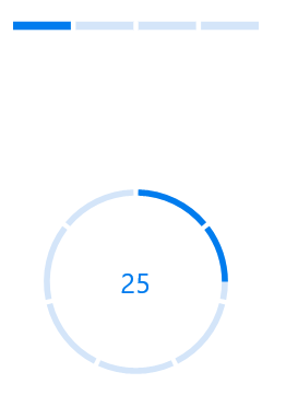
Linear and Circular Progress Bars with Segments
Additionally, you can adjust the size of the gaps between the segments using the GapWidth property as shown in the following code.
<!--Using linear progress bar-->
<progressBar:SfLinearProgressBar x_Name="LinearProgressBar" Progress="25" SegmentCount="4" GapWidth="5" />

<progressBar:SfCircularProgressBar x_Name="CircularProgressBar" Progress="25" SegmentCount="7" GapWidth="10" />
// Using linear progress bar.
this.LinearProgressBar.GapWidth = 5;
// Using circular progress bar.
this.CircularProgressBar.GapWidth = 10;
Linear and Circular Progress Bars with Modified Segment Gap
Custom angle
It is even possible to change the circle shape to a semicircle or arc by customizing the start and sweep angles of a circular progress bar using the StartAngle and EndAngle properties in the SfCircularProgressBar, as shown in the following code sample.
<progressBar:SfCircularProgressBar x_Name="CircularProgressBar" Progress="75" StartAngle="180" EndAngle="360"> </progressBar:SfCircularProgressBar>
SfCircularProgressBar circularProgressBar = new SfCircularProgressBar();
circularProgressBar.Progress = 75;
circularProgressBar.StartAngle = 180;
circularProgressBar.EndAngle = 360;
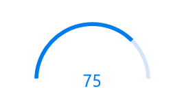
Circular Progress Bar with Modified Start and Sweep Angles
Custom content
Using the Content property, you can add any view to the center of the circular progress bar. This feature can be used to indicate the completion of the progress; add start, pause, or cancel buttons to control the progress interactively; add an image that indicates the actual task in progress; add custom text that conveys how much of the task is completed; and more.
The following code sample demonstrates adding custom content to a circular progress bar.
<progressBar:SfCircularProgressBar x_Name="CustomContentCircularProgressBar" Progress="23" HorizontalOptions="Center">
            <progressBar:SfCircularProgressBar.Content>
                <Grid>
                    <Grid.RowDefinitions>
                        <RowDefinition Height="*"/>
                        <RowDefinition Height="*"/>
                    </Grid.RowDefinitions>
                    <Label x_Name="CustomContentProgressBarLabel" Grid.Row="0" BindingContext="{x:Reference CustomContentCircularProgressBar}"
                           TextColor="#007cee" Text="{Binding Progress,StringFormat='{0}%'}" HorizontalTextAlignment="Center" VerticalTextAlignment="End">
                    </Label>
                    <Label Grid.Row="1" TextColor="#007cee" Text="used" VerticalOptions="Start" Margin="0,-5,0,0" HorizontalTextAlignment="Center" VerticalTextAlignment="Start">
                    </Label>
                </Grid>
            </progressBar:SfCircularProgressBar.Content>
</progressBar:SfCircularProgressBar>
SfCircularProgressBar circularProgressBar = new SfCircularProgressBar();
circularProgressBar.Progress = 23;
Grid grid = new Grid();
grid.RowDefinitions.Add(new RowDefinition() { Height = new GridLength(3, GridUnitType.Star) });
grid.RowDefinitions.Add(new RowDefinition() { Height = new GridLength(1, GridUnitType.Star) });
Label label = new Label();
label.BindingContext = circularProgressBar;
Binding binding = new Binding();
binding.Path = "Progress";
binding.StringFormat = "{0}%";
label.SetBinding(Label.TextProperty, binding);
label.HorizontalTextAlignment = TextAlignment.Center;
label.VerticalOptions = LayoutOptions.End;
label.FontSize = 10;
label.TextColor = Color.FromHex("007cee");
Grid.SetRow(label, 0);
grid.Children.Add(label);
Label textLabel = new Label();
textLabel.Text = "used";
textLabel.HorizontalTextAlignment = TextAlignment.Center;
textLabel.VerticalOptions = LayoutOptions.Start;
textLabel.FontSize = 10;
textLabel.TextColor = Color.FromHex("007cee");
Grid.SetRow(textLabel, 1);
grid.Children.Add(textLabel);
circularProgressBar.Content = grid;
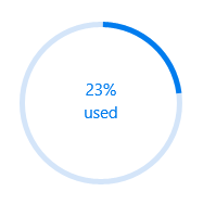
Circular Gauge with Custom Content
Appearance
Visualize multiple ranges
You can also visualize multiple ranges with different colors that are mapped to each range to enhance the readability of the progress bar.
The colors can be mapped to specific ranges using the RangeColors property in the linear progress bar. It holds the collection of RangeColor.
The following code sample illustrates mapping solid colors to the ranges in the linear progress bar.
<progressBar:SfLinearProgressBar Progress="100">
            <progressBar:SfLinearProgressBar.RangeColors>
                <progressBar:RangeColorCollection>
                    <progressBar:RangeColor Color="#00bdaf" Start="0" End="25"/>
                    <progressBar:RangeColor Color="#2f7ecc" Start="25" End="50"/>
                    <progressBar:RangeColor Color="#e9648e" Start="50" End="75"/>
                    <progressBar:RangeColor Color="#fbb78a" Start="75" End="100"/>
                </progressBar:RangeColorCollection>
            </progressBar:SfLinearProgressBar.RangeColors>
</progressBar:SfLinearProgressBar>
SfLinearProgressBar linearProgressBar = new SfLinearProgressBar();
linearProgressBar.Progress = 100;
linearProgressBar.RangeColors.Add(new RangeColor()
                                 {
                                   Color = Color.FromHex("00bdaf"),
                                   Start = 0, End = 25
                                 });
linearProgressBar.RangeColors.Add(new RangeColor()
                                 {
                                   Color = Color.FromHex("2f7ecc"),
                                   Start = 25, End = 50
                                 });
linearProgressBar.RangeColors.Add(new RangeColor()
                                 {
                                   Color = Color.FromHex("e9648e"),
                                   Start = 50, End = 75
                                 });
linearProgressBar.RangeColors.Add(new RangeColor()
                                 {
                                   Color = Color.FromHex("fbb78a"),
                                   Start = 75, End = 100
                                 });

Linear Progress Bar with Range Colors
You can enable the IsGradient property in the RangeColor instance to apply a gradient transition effect to the color as shown in the following code sample.
<progressBar:SfLinearProgressBar Progress="100">
            <progressBar:SfLinearProgressBar.RangeColors>
                <progressBar:RangeColorCollection>
                    <progressBar:RangeColor IsGradient="True" Color="#88A0D9EF" Start="0" End="25"/>
                    <progressBar:RangeColor IsGradient="True" Color="#AA62C1E5" Start="25" End="50"/>
                    <progressBar:RangeColor IsGradient="True" Color="#DD20A7DB" Start="50" End="75"/>
                    <progressBar:RangeColor IsGradient="True" Color="#FF1C96C5" Start="75" End="100"/>
                </progressBar:RangeColorCollection>
</progressBar:SfLinearProgressBar.RangeColors>
SfLinearProgressBar linearProgressBar = new SfLinearProgressBar();
linearProgressBar.Progress = 100;
linearProgressBar.RangeColors.Add(new RangeColor()
                                 {
                                   Color = Color.FromHex("88A0D9EF"),
                                   IsGradient = true,
                                   Start = 0 , End = 25
                                 });
linearProgressBar.RangeColors.Add(new RangeColor()
                                 {
                                   Color = Color.FromHex("AA62C1E5"),
                                   IsGradient = true,
                                   Start = 25, End = 50
                                 });
linearProgressBar.RangeColors.Add(new RangeColor()
                                 {
                                   Color = Color.FromHex("DD20A7DB"),
                                   IsGradient = true,
                                   Start = 50, End = 75
                                 });
linearProgressBar.RangeColors.Add(new RangeColor()
                                 {
                                   Color = Color.FromHex("FF1C96C5"),
                                   IsGradient = true,
                                   Start = 75, End = 100
                                 });

Linear Progress Bar with Range Color Gradient
Thickness
You can easily tweak the thickness of the track and progress indicator to render the control with different appearances.
Linear progress bar
Using the TrackHeight and Padding properties, you can customize the height of the track and the progress indicator’s padding in the linear progress bar.
<progressBar:SfLinearProgressBar Progress="100" TrackHeight="10" Padding="2">
</progressBar:SfLinearProgressBar>
SfLinearProgressBar linearProgressBar = new SfLinearProgressBar();
linearProgressBar.Progress = 100;
linearProgressBar.TrackHeight = 10;
linearProgressBar.Padding = 2;

Linear Progress Bar with Custom Padding and Thickness
Circular progress bar
In the circular progress bar, you can customize the thickness using the following properties:
- IndicatorOuterRadius: Defines the outer radius of the progress indicator.
- IndicatorInnerRadius: Defines the inner radius of the progress indicator.
- TrackOuterRadius: Defines the outer radius of the track.
- TrackInnerRadius: Defines the inner radius of the track.
The following code sample shows how to customize the thickness in a circular progress bar.
<progressBar:SfCircularProgressBar x_Name="TrackOutsideProgressBar" Progress="75" IndicatorOuterRadius="0.7" IndicatorInnerRadius="0.65" ShowProgressValue="False">
</progressBar:SfCircularProgressBar>
SfCircularProgressBar trackOutsideProgressBar = new SfCircularProgressBar();
trackOutsideProgressBar.Progress = 75;
trackOutsideProgressBar.IndicatorOuterRadius = 0.7;
trackOutsideProgressBar.IndicatorInnerRadius = 0.65;
trackOutsideProgressBar.ShowProgressValue = false;
Circular Progress Bar with Custom Padding and Thickness
Corner radius
You can customize the corner radius of the progress bar by using the CornerRadius property in the linear progress bar.
<progressBar:SfLinearProgressBar Progress="50" TrackHeight="10" CornerRadius="10">
</progressBar:SfLinearProgressBar>
SfLinearProgressBar linearProgressBar = new SfLinearProgressBar();
linearProgressBar.Progress = 50;
linearProgressBar.CornerRadius = 10;

Linear Progress Bar with Custom Corner Radius
Colors
You can also apply appealing colors to the track and progress indicator to match your app theme. Colors can be customized using the TrackColor and ProgressColor properties as shown in the following code sample.
<progressBar:SfLinearProgressBar Progress="75" TrackColor="#3351483a" ProgressColor="#FF51483a">
</progressbar:SfLinearProgressBar>
SfLinearProgressBar linearProgressBar = new SfLinearProgressBar();
linearProgressBar.Progress = 75;
linearProgressBar.ProgressColor = Color.FromHex("FF51483a");
linearProgressBar.TrackColor = Color.FromHex("3351483a");

Linear Progress Bar with Custom Colors
A sample demonstrating the progress bar control and its various features can be downloaded here.
Conclusion
The Syncfusion Xamarin.Forms progress bar control is designed with flexible UI customizations to adapt to your app easily. It includes developer-friendly APIs to increase developer productivity. This control is also available for Xamarin.Android and Xamarin.iOS.
We hope that this component will help satisfy your application development needs and recommend you further explore this control by downloading the sample created specifically for this blog. Syncfusion Xamarin.Forms offers the most comprehensive suite of advanced UI components that work out of the box in all three platforms, providing platform-specific themes and adaptive rendering for all mobile, tablet, desktop form factors.
Try out our products by downloading the free trial setup and explore the samples available on Google Play, Windows Store and the App Store. If you have any questions or feedback, please let us know in the comments below. You can also contact us through our support forum or Direct-Trac. We are happy to assist you!
If you liked this post, we think you’ll also enjoy: