
Introduction
Welcome to a quick walk-through of Syncfusion’s autocomplete control for the Xamarin.Forms platform. The autocomplete control provides end users with possible matches as soon as they start typing, and includes key features like different suggestion modes, matching text highlights, multi-selection, diacritic sense, custom search, and much more.
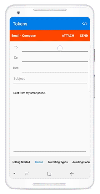
In this blog, we will learn how to build the UI depicted in the following figure.

Xamarin.Forms autocomplete control
Creating a project from a Visual studio template
Refer to this section of the Xamarin Getting Started guide to create a Xamarin.Forms application through Visual Studio.
Adding references from NuGet
Refer to our documentation for the steps for obtaining Essential Studio components in your solution.
Note: Refer to our documentation for the dependency assembly details for adding the autocomplete control to your project.
Adding control initialization code
For our first example, let’s look at an emailing scenario like the one in the previous image, where the To address bar needs an autocomplete control. In the following steps, the necessary XAML code has been added to initialize the autocomplete control.
Step 1: Include the SfAutoComplete namespace in the respective page.
<contentpage x_class="MultiSelect.MainPage">
  </contentpage>
Step 2: Declare SfAutoComplete with the content page by defining the height as 40, since the address bar needs a 40-pixel height.
<contentpage x_class="MultiSelect.MainPage">
              <autocomplete:sfautocomplete heightrequest="40">
  </autocomplete:sfautocomplete></contentpage>

Autocomplete control with 40-pixel height
Binding data
Naturally, the autocomplete control will need to be bound with a data source. For our example, we need to show contact details such as names, IDs, pictures, and their online status. So, we need to create a model and its data as follows.
Creating model
Here we are creating a real-time entity named ContactsInfo with necessary members such as name, ID, online status, and picture.
public class ContactsInfo
      {
          public string ContactName { get; set;}
          public string ContactID { get; set;}
          public string ContactStatus { get; set;}
          public ImageSource ContactImage { get; set;}

      }
View model
Next, we create the ViewModel class to hold the collection of contacts by populating the ContactsInfo for several entities with their values for contact name, ID, online status, and picture.
 public class ViewModel
      {
          public
  ObservableCollection<contactsinfo> Contacts = new
  ObservableCollection<contactsinfo>();
          public ViewModel()
          {
              Contacts =
  GetContactDetails();
          }

          private Random random = new Random();

          public
  ObservableCollection<contactsinfo> GetContactDetails()
          {

  ObservableCollection<contactsinfo> customerDetails = new
  ObservableCollection<contactsinfo>();

              for (int i = 0; i < CustomerNames.Count(); i++)
              {
                  var details = new ContactsInfo()
                  {

  ContactType = contactType[random.Next(0, 5)],
                      ContactName = CustomerNames[i],

  ContactNumber = CustomerNames[i].Replace(" ", "") + "@outlook.com",


  ContactImage = "Image" + (i % 19) + ".png",
                  };

  customerDetails.Add(details);
              }
              return customerDetails;
          }

          string[] contactStatus = new string[]
          {
              "Available.png", "Offline.png", "Away.png","Busy.png", "DND.png"
          };

          string[] CustomerNames = new string[]
          {
              "Kyle","Gina","Irene","Katie","Michael",
              "Oscar","Ralph","Torrey","William","Bill",
              "Daniel","Frank","Brenda","Danielle","Fiona",
              "Howard","Jack","Larry","Holly","Jennifer",
              "Liz","Pete","Steve","Vince","Zeke",
              "Aiden","Jackson","Mason","Liam","Jacob",
              "Jayden","Ethan","Noah","Lucas","Logan",
              "Caleb","Caden","Jack","Ryan","Connor",
              "Michael","Elijah","Brayden","Benjamin","Nicholas",
              "Alexander","William","Matthew","James","Landon",
              "Nathan","Dylan","Evan","Luke","Andrew",
              "Gabriel","Gavin","Joshua","Owen","Daniel",
              "Carter","Tyler","Cameron","Christian","Wyatt",
              "Henry","Eli","Joseph","Max","Isaac",
              "Samuel","Anthony","Grayson","Zachary","David",
              "Christopher","John","Isaiah","Levi","Jonathan",
              "Oliver","Chase","Cooper","Tristan","Colton",
              "Austin","Colin","Charlie","Dominic","Parker",
              "Hunter","Thomas", "Alex","Ian","Jordan",
              "Cole","Julian","Aaron","Carson","Miles",
              "Blake","Brody","Adam","Sebastian","Adrian",
              "Nolan","Sean","Riley","Bentley","Xavier",
              "Hayden","Jeremiah","Jason","Jake","Asher",
              "Micah","Jace","Brandon","Josiah","Hudson",
              "Nathaniel","Bryson", "Ryder","Justin","Bryce",
          };

      }
Now, we can bind the ViewModel’s contacts collection to SfAutoComplete in the XAML page.
 <contentpage x_class="MultiSelect.MainPage">
             <autocomplete:sfautocomplete heightrequest="40" datasource="{Binding Contacts}">
 </autocomplete:sfautocomplete></contentpage>
After the data source has been applied to the autocomplete control, it will simply read the whole object, so the name you want to search for should be assigned to the DisplayMemberPath of the control.
 <contentpage x_class="MultiSelect.MainPage">
             <autocomplete:sfautocomplete heightrequest="40" datasource="{Binding Contacts}" dropdownitemsheight="40" dropdowncornerradius="20" dropdownmaximunheight="160" displaymemberpath="ContactName">
 </autocomplete:sfautocomplete></contentpage>
Note: With the previous code, we have customized the drop-down’s corner, item height, and maximum height. After these customizations the design looks like the following figure:

Autocomplete control with customized appearance
Configuring autocomplete to achieve the desired style by using a template
The autocomplete control allows you to provide templates to the pop-up items. For our requirements, we need to display the contact’s image with an online status notification to the left, and the contact’s name and email ID to the right.
<contentpage x_class="MultiSelect.MainPage">
    <autocomplete:sfautocomplete heightrequest="40" datasource="{Binding Contacts}" displaymemberpath="ContactName">
        <autocomplete:sfautocomplete.itemtemplate>
            <datatemplate>
                <stacklayout padding="15,10" verticaloptions="Center" horizontaloptions="Start" orientation="Horizontal">

                    <grid>
                        <img source="{Binding ContactType}" verticaloptions="Center" horizontaloptions="Center" heightrequest="50" widthrequest="50" data-action="zoom">
                        <img source="{Binding ContactImage}" verticaloptions="Center" horizontaloptions="Center" heightrequest="46" widthrequest="46" data-action="zoom">
                    </grid>
                    <stacklayout margin="10,5" orientation="Vertical">
                        <label text="{Binding ContactName}" fontsize="18"></label>
                        <label text="{Binding ContactNumber}" fontsize="12"></label>
                    </stacklayout>

                </stacklayout>
            </datatemplate>
        </autocomplete:sfautocomplete.itemtemplate>
    </autocomplete:sfautocomplete>
 </contentpage>
Now, the control appears like so:

Pop-up items with templates applied
Enabling token selection
The autocomplete control supports built-in customizable token styles for the close button. This support is enabled by setting DisplayMode to MultiSelectToken.
<contentpage x_class="MultiSelect.MainPage">
   <autocomplete:sfautocomplete heightrequest="40" datasource="{Binding Contacts}" displaymemberpath="ContactName" displaymode="MultiSelectToken" tokenlayoutmode="VerticalWarp">
       <autocomplete:sfautocomplete.itemtemplate>
           <datatemplate>
               <stacklayout padding="15,10" verticaloptions="Center" horizontaloptions="Start" orientation="Horizontal">
                   <grid>
                       <img source="{Binding ContactType}" verticaloptions="Center" horizontaloptions="Center" heightrequest="50" widthrequest="50">
                       <img source="{Binding ContactImage}" verticaloptions="Center" horizontaloptions="Center" heightrequest="46" widthrequest="46">
                   </grid>
                   <stacklayout margin="10,5" orientation="Vertical">
                                   <label text="{Binding ContactName}" fontsize="18"></label>
                                   <label text="{Binding ContactNumber}" fontsize="12"></label>
                   </stacklayout>
               </stacklayout>
           </datatemplate>
       </autocomplete:sfautocomplete.itemtemplate>
   </autocomplete:sfautocomplete>
</contentpage>
Also with the previous code, TokenLayoutMode has been set as VerticalWarp. This TokenLayoutMode helps us place the overflowed token in either a horizonal scroll or vertical wrap.

Autocomplete control with customized token style
Customizing other fields
As stated previously, we are preparing a very simple email composing module with some fields such as To and Subject, a main editor, and buttons like Send and Cancel. The following code will meet our UI requirements.
<!--?xml version="1.0" encoding="utf-8" ?--><!--?xml version="1.0" encoding="utf-8" ?-->
 <contentpage x_class="MultiSelect.MainPage">
 <!--AutoComplete style will be
 updated-->
     <grid>
         <grid.rowdefinitions>
             <rowdefinition height="Auto"> <!--For Header-->
             <rowdefinition height="Auto"> <!--For Address bar and subject-->
             <rowdefinition height="*"> <!--For main editor-->
         </rowdefinition></rowdefinition></rowdefinition></grid.rowdefinitions>

         <grid backgroundcolor="OrangeRed" heightrequest="50">
             <grid.columndefinitions>
                 <columndefinition width="*">
                 <columndefinition width="Auto">
                 <columndefinition width="Auto">
             </columndefinition></columndefinition></columndefinition></grid.columndefinitions>

 <!--Adding header with Send and
 Cancel buttons-->
             <label margin="10,0" text="Email
 - Compose" fontattributes="Bold" verticaloptions="Center" textcolor="White">
             <label grid.column="1" margin="10,0" text="CANCEL" fontattributes="Bold" verticaloptions="Center" textcolor="White">
             <label grid.column="2" text="SEND" margin="10,0" fontattributes="Bold" verticaloptions="Center" textcolor="White">
         </label></label></label></grid>

         <grid grid.row="1" margin="10,0,10,0">
             <grid.columndefinitions>
                 <columndefinition width="40"> <!--For Title field-->
                 <columndefinition width="*"> "/> <!--For SfAutoComplete-->
             </columndefinition></columndefinition></grid.columndefinitions>
             <grid.rowdefinitions>
                 <rowdefinition height="50"> <!--For To field-->
                 <rowdefinition height="50"> <!--For Cc field-->
                 <rowdefinition height="50"> <!--For Bcc field-->
             </rowdefinition></rowdefinition></rowdefinition></grid.rowdefinitions>

             <label text="To" verticaloptions="Center" horizontaloptions="Center">

 <!--Here’s our SfAutoComplete for To
 address -->
             <autocomplete:sfautocomplete grid.column="1" heightrequest="40">

             <label text="To" grid.row="1" verticaloptions="Center" horizontaloptions="Center">

 <!--Here’s our SfAutoComplete for Cc
 address-->
             <autocomplete:sfautocomplete grid.row="1" grid.column="1" heightrequest="40">

             <label text="To" grid.row="2" verticaloptions="Center" horizontaloptions="Center">

 <!--Here’s our SfAutoComplete for
 Bcc address -->
             <autocomplete:sfautocomplete grid.row="2" grid.column="1" heightrequest="40">


         </autocomplete:sfautocomplete></label></autocomplete:sfautocomplete></label></autocomplete:sfautocomplete></label></grid>

         <grid grid.row="2" margin="10,0,10,0">
             <grid.rowdefinitions>
                 <rowdefinition height="50"> <!--For Subject field-->
                 <rowdefinition height="*"> <!--For Main editor-->
             </rowdefinition></rowdefinition></grid.rowdefinitions>
             <entry margin="5,0,0,0" placeholder="Subject" fontsize="15">
             <editor margin="5,10" fontsize="12" grid.row="1" text="Sent
 from my smartphone.">

         </editor></entry></grid>
     </grid>
 </contentpage>
Conclusion
The autocomplete control is designed with high customization for every aspect. This control also includes powerful APIs to increase developers’ productivity.
You can download the complete sample from this link.