In case you miss Part 1, you can read it here: Overview of Data Grid in Xamarin.Forms Part 1
Previously, we looked at the basics of the Syncfusion data grid, how it can be used to view data from all common data sources, and also how easy it is to configure its columns.
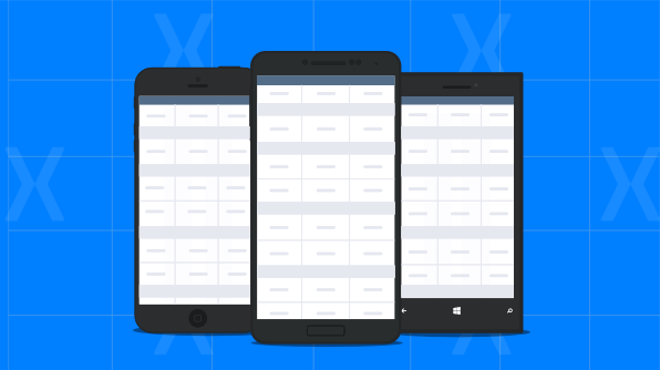
In this blog post, I’m going to explore other cool features of the Syncfusion data grid like styling, data shaping and manipulation, swiping, and other interactive and advanced features that would help you attain the best user experience in your application. The following screenshots provide a clearer picture of the data grid control customizations.

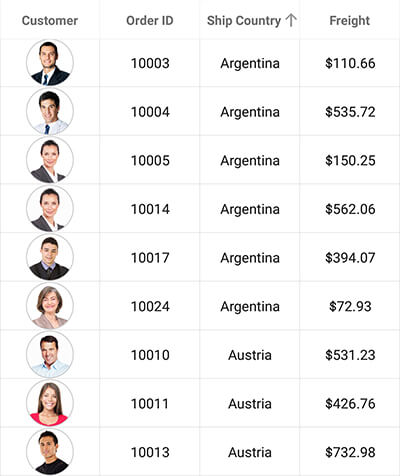
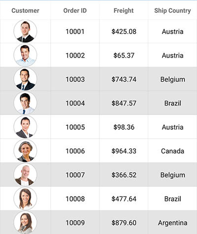
Sorting data
The data grid control allows you to sort data against one or more columns easily by tapping the column headers. Using tri-state sorting, it is possible to reverse the changes after sorting has been applied. One of the highlights of sorting is that the data grid also supports custom sorting, allowing you to write your own sorting logic for organizing data. Additionally, the data grid allows you to enable and restrict sorting for individual columns.
Sorting in the data grid is enabled by setting the SfDataGrid.AllowSorting property to true. The following code example illustrates enabling sorting in the data grid control.
<syncfusion:SfDataGrid x:Name="dataGrid"
                        AllowSorting="True"
                        ItemsSource="{Binding OrdersInfo}">
To enable tri-state sorting and multi-column sorting, you need to set the SfDataGrid.AllowTriStateSorting and SfDataGrid.AllowMultiSorting properties to true as shown in the following code example.
<syncfusion:SfDataGrid x:Name="dataGrid"
                        AllowSorting="True"
                        AllowTriStateSorting="True"
                        AllowMultiSorting="True"
                        ItemsSource="{Binding OrdersInfo}">
The data grid control also allows you to sort data programmatically. This requires to manually defining SortColumnDescription objects, and adding them in the SfDataGrid.SortColumnDescriptions collection as shown in the following code example.
<syncfusion:SfDataGrid x:Name="dataGrid"
                        ItemsSource="{Binding OrdersInfo}">

    <syncfusion:SfDataGrid.SortColumnDescriptions>
        <syncfusion:SortColumnDescription ColumnName="ShipCountry"  SortDirection="Ascending" />
    </syncfusion:SfDataGrid.SortColumnDescriptions>
</syncfusion:SfDataGrid>
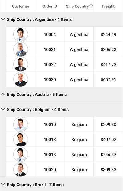
Grouping data
The grouping function categorizes data into several groups. You can group data by one or more columns programmatically with customizable templates for the entire row and individual cells. Groups can be expanded or collapsed. The data grid control also allows you to write your own logic to group data based on your application requirements.
Grouping a column programmatically requires manually defining GroupColumnDescription objects, and adding them in the SfDataGrid.GroupColumnDescriptions collection as shown in the following code example.
<syncfusion:SfDataGrid x:Name="dataGrid"
                        ItemsSource="{Binding OrdersInfo}">

    <syncfusion:SfDataGrid.GroupColumnDescriptions>
        <syncfusion:GroupColumnDescription ColumnName="ShipCountry" />
    </syncfusion:SfDataGrid.GroupColumnDescriptions>
</syncfusion:SfDataGrid>
Expanding and collapsing groups can be controlled by using the SfDataGrid.AllowGroupExpandCollapse property.
<syncfusion:SfDataGrid x:Name="dataGrid"
                        AllowGroupExpandCollapse="True"
                        ItemsSource="{Binding OrdersInfo}">

    <syncfusion:SfDataGrid.GroupColumnDescriptions>
        <syncfusion:GroupColumnDescription ColumnName="ShipCountry" />
    </syncfusion:SfDataGrid.GroupColumnDescriptions>
</syncfusion:SfDataGrid>
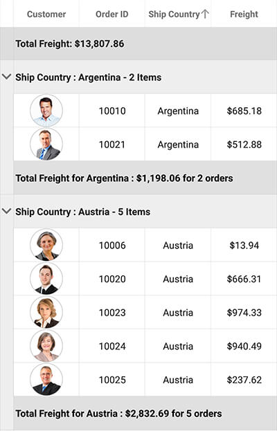
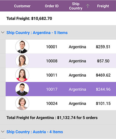
Display summary information for groups or the entire grid
The data grid control provides support to display summary information for the entire grid or individual groups. You can calculate and display sum, min, max, average, count, and custom aggregates to show summarized information for all the data or just a section. It also allows you to load customizable templates for the entire summary row and for individual cells based on your requirements.
The following code example illustrates how to define summaries for groups and the entire data grid.
<syncfusion:SfDataGrid x:Name="dataGrid"
                        ItemsSource="{Binding OrdersInfo}">

    <syncfusion:SfDataGrid.GroupColumnDescriptions>
        <syncfusion:GroupColumnDescription ColumnName="ShipCountry" />
    </syncfusion:SfDataGrid.GroupColumnDescriptions>

    <syncfusion:SfDataGrid.GroupSummaryRows>
        <syncfusion:GridGroupSummaryRow Title="Total Freight for {Key} : {FreightAmount} for {OrderCount} orders" ShowSummaryInRow="True">
            <syncfusion:GridGroupSummaryRow.SummaryColumns>
                <syncfusion:GridSummaryColumn Name="FreightAmount"
                                Format="{}{Sum:c}"
                                MappingName="Freight"
                                SummaryType="DoubleAggregate" />
                <syncfusion:GridSummaryColumn Name="OrderCount"
                                Format="{}{Count:d}"
                                MappingName="OrderID"
                                SummaryType="CountAggregate" />
            </syncfusion:GridGroupSummaryRow.SummaryColumns>
        </syncfusion:GridGroupSummaryRow>
    </syncfusion:SfDataGrid.GroupSummaryRows>

    <syncfusion:SfDataGrid.TableSummaryRows>
        <syncfusion:GridTableSummaryRow Title="Total Freight: {freight}"
                                    Position="Top"
                                    ShowSummaryInRow="True">
            <syncfusion:GridTableSummaryRow.SummaryColumns>
                <syncfusion:GridSummaryColumn Name="freight"
                                            Format="{}{Sum:c}"
                                            MappingName="Freight"
                                            SummaryType="DoubleAggregate" />
            </syncfusion:GridTableSummaryRow.SummaryColumns>
        </syncfusion:GridTableSummaryRow>
    </syncfusion:SfDataGrid.TableSummaryRows>
</syncfusion:SfDataGrid>
Editing
The data grid control provides in-place editing support with built-in column types for the best editing experience. It also provides built-in support for text, numeric, picker, and date picker editors with support to commit or roll back changes. Further, it also allows you to enable and restrict editing for individual columns as well.
The following code example shows how to enable editing in a data grid control.
<syncfusion:SfDataGrid x:Name="dataGrid"
                        AllowEditing="True"
                        ItemsSource="{Binding OrdersInfo}" />
The data grid control allows you to enter edit mode either on tap or double tap using the SfDataGrid.EditTapAction property, and allows you to either select all the text or move to the last position when entering edit mode, which can be customized using the SfDataGrid.EditorSelectionBehavior property.
<syncfusion:SfDataGrid x:Name="dataGrid"
                        AllowEditing="True"
                        EditorSelectionBehavior="MoveLast"
                        EditTapAction="OnDoubleTap"
                        ItemsSource="{Binding OrdersInfo}" />

Styling
The styles for every view in the grid can be customized to display visually appealing data based on the application requirements. You can apply alternate row colors and customize the vertical, horizontal, or both borders in cells for better readability.
The following code example illustrates creating a custom style and applying it to a data grid control.
<syncfusion:SfDataGrid x:Name="dataGrid"
                        GridStyle="{local:PurpleStyle}"
                        ItemsSource="{Binding OrdersInfo}" />
public class PurpleStyle : DataGridStyle
{
    public PurpleStyle()
    {
    }

    public override Color GetHeaderBackgroundColor()
    {
        return Color.FromHex("#83538B");
    }

    public override Color GetHeaderForegroundColor()
    {
        return Color.FromRgb(255, 255, 255);
    }

    public override Color GetSelectionBackgroundColor()
    {
        return Color.FromRgb(149, 117, 205);
    }

    public override Color GetSelectionForegroundColor()
    {
        return Color.FromRgb(255, 255, 255);
    }

    public override Color GetAlternatingRowBackgroundColor()
    {
        return Color.FromRgb(237, 231, 246);
    }

    public override Color GetRecordForegroundColor()
    {
        return Color.FromRgb(0, 0, 0);
    }

    public override GridLinesVisibility GetGridLinesVisibility()
    {
        return GridLinesVisibility.Horizontal;
    }
}
The data grid control also allows you to customize cell and row appearances conditionally based on the data in XAML using the GridColumn.CellStyle property. It also provides SfDataGrid.QueryRowStyle and SfDataGrid.QueryCellStyle events to apply styles and formatting to the data in the cells. Also, rows and columns can be styled with customizable preferences when selected.
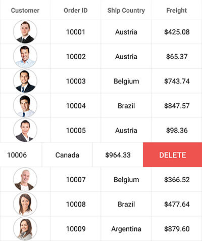
Swiping
The data grid control provides support to load your desired views on both the left and right sides of the data rows. Associate swipe templates with custom actions that are displayed by swiping from left to right or right to left over a data row. You can enable the swiping functionality in the data grid control using the SfDataGrid.AllowSwiping property. The offset for the swipe views can be customized using the SfDataGrid.MaxSwipeOffset property.
The following code example shows how to load a button as a right-swipe template, which upon tapping deletes the corresponding row in the data grid control. Similarly, you can customize the left-swipe template as well.
<syncfusion:SfDataGrid x:Name="dataGrid"
                        AllowSwiping="True"
                        MaxSwipeOffset="120"
                        ItemsSource="{Binding OrdersInfo}">

    <syncfusion:SfDataGrid.RightSwipeTemplate>
        <DataTemplate>
            <Button x:Name="swipeButton" Text="DELETE" BackgroundColor="#EF5350" TextColor="White"
                    Command="{Binding DeleteCommand, Source={x:Reference viewModel}}"
                    CommandParameter="{Binding Source={x:Reference swipeButton}, Path=BindingContext}" />
        </DataTemplate>
    </syncfusion:SfDataGrid.RightSwipeTemplate>
</syncfusion:SfDataGrid>
public class ViewModel
{
    public ViewModel()
    {
        DeleteCommand = new Command<OrderInfo>(DeleteSwipedRow);
    }

    private void DeleteSwipedRow(OrderInfo order)
    {
        //Remove the object from the data source here.
        this.OrdersInfo.Remove(order);
    }

    public Command<OrderInfo> DeleteCommand { get; set; }
}
Dragging and dropping
The data grid allows end users to reorder rows and columns based on their priorities and requirements by dragging and dropping rows and columns. Enable column drag and drop functionality using the SfDataGrid.AllowDraggingColumn property and row drag and drop functionality using the SfDataGrid.AllowDraggingRow property as shown in the following code example.
<syncfusion:SfDataGrid x:Name="dataGrid"
                        AllowDraggingColumn="True"
                        AllowDraggingRow="True"
                        ItemsSource="{Binding OrdersInfo}" />
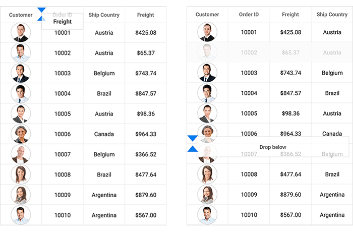
The data grid control allows you to control the column and row dragging using the SfDataGrid.QueryColumnDragging and SfDataGrid.QueryRowDragging events.
Resizing
The data grid control lets you resize a column on the move or after lifting your finger from the screen, making it easier to read data larger than its cell. Restrict a column with a minimum width to avoid hiding the column and a maximum width to restrict resizing beyond the limit.
The following code example shows how to enable column resizing and customize its mode.
<syncfusion:SfDataGrid x:Name="dataGrid"
                        AllowResizingColumn="True"
                        ResizingMode="OnMoved"
                        ItemsSource="{Binding OrdersInfo}" />
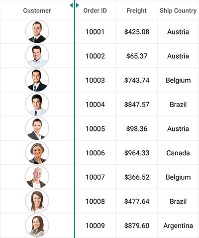
The data grid control allows you to control column resizing using the SfDataGrid.ColumnResizing event.
Selection modes
The data grid supports single and multiple selection when rows are tapped, with customizable selection background and foreground colors. In addition, it provides a special selection mode called single deselect, which lets you deselect a selected row by tapping it again. It is also possible to apply animation to the selected rows for a unique selection experience.
The following code example shows how to customize selection in the data grid control.
<syncfusion:SfDataGrid x:Name="dataGrid"
                        SelectionMode="Multiple"
                        ItemsSource="{Binding OrdersInfo}" />
The data grid control allows you to control and customize selection using the SfDataGrid.SelectionChanging and SfDataGrid.SelectionChanged events.
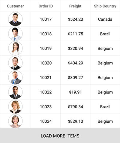
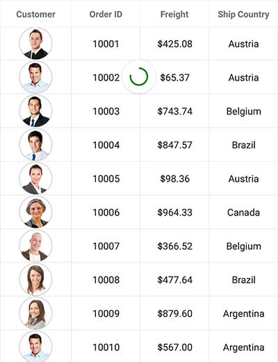
Loading more items
The data grid control allows you to load a subset of data at run time using the load more feature. You can customize the Load More Items option and set its position to either the top or bottom of the grid.
The data grid also provides support to automatically load data in chunks when reaching the end of the grid. After scrolling down and reaching the end of the visible grid, when the data is not available in the internal cache, it triggers an action to get the data from the server, offline repository, or a web service.
The following code example shows how to configure the load more functionality of the data grid control.
<syncfusion:SfDataGrid x:Name="dataGrid"
                        AllowLoadMore="True"
                        LoadMoreCommand="{Binding LoadMoreCommand}"
                        IsBusy="{Binding IsBusy}"
                        ItemsSource="{Binding OrdersInfo}" />
public class ViewModel : INotifyPropertyChanged
{
    private bool isBusy;

    public ViewModel()
    {
        LoadMoreCommand = new Command(LoadMoreItemsToDataSource);
        IsBusy = false;
    }

    public Command LoadMoreCommand { get; set; }

    public bool IsBusy
    {
        get { return isBusy; }
        set
        {
            this.isBusy = value;
            RaisePropertyChanged("IsBusy");
        }
    }

    internal void LoadMoreItemsToDataSource(object obj)
    {
        this.IsBusy = true;
        //Load more items to the data source here.
        this.IsBusy = false;
    }

    ...

}
Pull to refresh
Refreshing the data source at run time when performing a pull-to-refresh action is one of the most important requirements in any data-centered application. The data grid control understands this and has built-in options for refreshing when pulling the grid.
The data grid control is also compatible with our pull-to-refresh control, which further allows you to customize the pull-to-refresh view with sliding and pushing transition modes for a native pull-to-refresh experience.
The following code example shows how to configure the pull-to-refresh control with the data grid and refresh the data.
<pullToRefresh:SfPullToRefresh x:Name="pullToRefresh"
                               PullingThreshold="100">

    <pullToRefresh:SfPullToRefresh.Behaviors>
        <local:PullToRefreshBehavior />
    </pullToRefresh:SfPullToRefresh.Behaviors>

    <pullToRefresh:SfPullToRefresh.PullableContent>
        <syncfusion:SfDataGrid x:Name="dataGrid"
                        ItemsSource="{Binding OrdersInfo}">
        </syncfusion:SfDataGrid>
    </pullToRefresh:SfPullToRefresh.PullableContent>
</pullToRefresh:SfPullToRefresh>
Refreshing the data can be done by hooking the Refreshing event of the pull-to-refresh control as shown in the following sample.
public class PullToRefreshBehavior : Behavior<SfPullToRefresh>
{
    protected override void OnAttachedTo(SfPullToRefresh pullToRefresh)
    {
        base.OnAttachedTo(pullToRefresh);
        pullToRefresh.Refreshing += PullToRefresh_Refreshing;
    }

    private void PullToRefresh_Refreshing(object sender, EventArgs e)
    {
        var pullToRefresh = sender as SfPullToRefresh;
        pullToRefresh.IsRefreshing = true;
        //Refresh your data source here.
        pullToRefresh.IsRefreshing = false;
    }

    protected override void OnDetachingFrom(SfPullToRefresh pullToRefresh)
    {
        pullToRefresh.Refreshing -= PullToRefresh_Refreshing;
        base.OnDetachingFrom(pullToRefresh);
    }
}
Other features
There are many other features in the data grid control that can be useful when designing and building your applications. Here are some featured highlights with references to their documentation.
Filtering records as needed
Easily filter records by setting a predicate to the view to search for data that satisfies your needs and constraints. Refer to our documentation for more details about filtering data.
Row and cell customization
The data grid control provides support to customize cell and row appearances conditionally based on the data. It is also possible to load any control inside a cell by using a cell template to customize its appearance. The data grid also allows you to apply styles and formatting to the data in the cells. The rows and columns can be styled with customizable preferences when selected.
Autofit content in rows and cells
The data grid control provides support to change the height of a row based on the content of any column or specific columns conditionally based on your requirements to greatly enhance readability.
It also provides support to customize the width of individual columns or the entire grid using various built-in column sizing options.
Pinning rows and columns
Freeze rows and columns at the top and left positions in the view, similar to Excel, for improved readability. Refer to our documentation for more details about freezing the view.
Data virtualization
Create records on demand automatically by enabling the data virtualization feature to efficiently process data. Virtualization is enabled using the SfDataGrid.EnableDataVirtualization property.
To render the grid data in pages, manipulate the data using our data pager control. Load new pages on demand with options to maintain and reset the cache. It is also possible to customize visually appealing styles for the pager control based on device and application requirements.
Exporting
The data grid control supports exporting the data to Excel and PDF formats. It also provides a variety of appearance customization options such as excluding specific columns, excluding headers, setting custom row heights, setting custom column widths, and much more. The data grid control can also be exported to a particular page or position in a PDF document. Refer to our export to Excel and export to PDF documentation for more details about exporting data.
Conclusion
In this blog post, we have walked through the key features of our data grid control for Xamarin.Forms. Be sure to download the data grid applications to deploy readily runnable samples to experience how easy it is to use the Syncfusion data grid and its rich feature set!
If you are a current customer, we invite you to check out the data grid control for Xamarin. If you are not a current customer, you can always download our free evaluation to see it in action. You can also explore the data grid samples available on Google Play Windows Store and App Store, and learn about advanced features in our documentation.
If you have any questions or require clarifications, please let us know in the comments section below. You can also contact us through our support forum or Direct-Trac. We are happy to assist you!
If you like this blog post, we think you’ll also like the following free e-books: