Note: The chart creation and configuration in this blog is explained entirely with XAML code. However, it can also be done in C# code.
Adding the chart reference
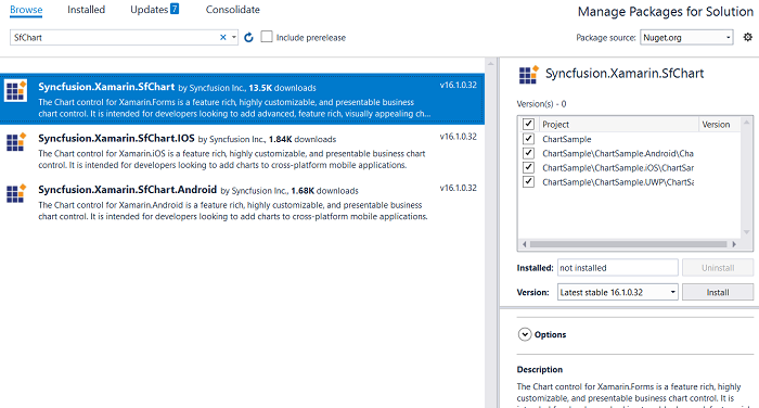
- Right-click the solution and choose Manage NuGet Packages for Solution.
- Select nuget.org from the Package source drop-down.
- Search for SfChart using the search box, and then select Syncfusion.Xamarin.SfChart from the search results.
- Select all the target platform projects along with the PCL or .NET Standard library from the Projects box.
- Install the package.
https://help.syncfusion.com/xamarin/charts/getting-started#adding-sfchart-reference
Creating a chart
<?xml version="1.0" encoding="utf-8" ?>
<ContentPage


             x_Class="ChartGettingStarted.MainPage">

    <chart:SfChart>
        <chart:SfChart.PrimaryAxis>
            <chart:CategoryAxis/>
        </chart:SfChart.PrimaryAxis>
        <chart:SfChart.SecondaryAxis>
            <chart:NumericalAxis/>
        </chart:SfChart.SecondaryAxis>
    </chart:SfChart>

</ContentPage>
After configuring the code, run the app on all targeted platforms to make sure the chart is properly set up and added in the correct position of the screen.
Populating data
public class Model
{
public string Year { get; set; }
public double Value { get; set; }
}
public class ViewModel
{
public List<Model> ProductA { get; set; }
public List<Model> ProductB { get; set; }
public ViewModel()
{
ProductA = new List<Model>();
ProductB = new List<Model>();
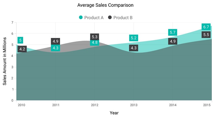
ProductA.Add(new Model { Year = "2010", Value = 5 });
ProductA.Add(new Model { Year = "2011", Value = 4.3 });
ProductA.Add(new Model { Year = "2012", Value = 4.8 });
ProductA.Add(new Model { Year = "2013", Value = 5.2 });
ProductA.Add(new Model { Year = "2014", Value = 5.7 });
ProductA.Add(new Model { Year = "2015", Value = 6.7 });
ProductB.Add(new Model { Year = "2010", Value = 4.2 });
ProductB.Add(new Model { Year = "2011", Value = 4.9 });
ProductB.Add(new Model { Year = "2012", Value = 5.3 });
ProductB.Add(new Model { Year = "2013", Value = 4.3 });
ProductB.Add(new Model { Year = "2014", Value = 4.9 });
ProductB.Add(new Model { Year = "2015", Value = 5.5 });
}
}
<?xml version="1.0" encoding="utf-8" ?>
<ContentPage


             x_Class="ChartGettingStarted.MainPage">

    <ContentPage.BindingContext>
        <local:ViewModel/>
    </ContentPage.BindingContext>
</ContentPage>
<chart:SfChart>
…
    <chart:SplineAreaSeries ItemsSource="{Binding ProductA}" XBindingPath="Year" YBindingPath="Value"></chart:SplineAreaSeries>
    <chart:SplineAreaSeries ItemsSource="{Binding ProductB}" XBindingPath="Year" YBindingPath="Value"></chart:SplineAreaSeries>
</chart:SfChart>
Setting a title
<chart:SfChart>

    <chart:SfChart.Title>
        <chart:ChartTitle Text="Average Sales Comparison"></chart:ChartTitle>
    </chart:SfChart.Title>

</chart:SfChart>
Enabling the legend
<chart:SfChart>

    <chart:SfChart.Legend>
        <chart:ChartLegend></chart:ChartLegend>
    </chart:SfChart.Legend>

    <chart:SplineAreaSeries ItemsSource="{Binding ProductA}" Label="Product A" XBindingPath="Year" YBindingPath="Value"></chart:SplineAreaSeries>

    <chart:SplineAreaSeries ItemsSource="{Binding ProductB}" Label="Product B" XBindingPath="Year" YBindingPath="Value"></chart:SplineAreaSeries>

</chart:SfChart>
Enabling data labels
Data points can be easily annotated with labels to improve the readability of the data. The readability can also be further enhanced by adding markers or customizable symbols. Labels are generally used when the chart has a small amount of data, otherwise the trackball or tooltip features are used to view information about data points for their good performance in more densely populated charts.
<chart:SfChart>

    <chart:SplineAreaSeries ItemsSource="{Binding ProductA}" Label="Product A" XBindingPath="Year" YBindingPath="Value">
        <chart:SplineAreaSeries.DataMarker>
            <chart:ChartDataMarker></chart:ChartDataMarker>
        </chart:SplineAreaSeries.DataMarker>
    </chart:SplineAreaSeries>

    <chart:SplineAreaSeries ItemsSource="{Binding ProductB}" Label="Product B" XBindingPath="Year" YBindingPath="Value">
        <chart:SplineAreaSeries.DataMarker>
            <chart:ChartDataMarker></chart:ChartDataMarker>
        </chart:SplineAreaSeries.DataMarker>
    </chart:SplineAreaSeries>

</chart:SfChart>
The following code sample is the complete chart configuration.
<chart:SfChart>

    <chart:SfChart.Legend>
        <chart:ChartLegend></chart:ChartLegend>
    </chart:SfChart.Legend>

    <chart:SfChart.Title>
        <chart:ChartTitle text="Average Sales Comparison"></chart:ChartTitle>
    </chart:SfChart.Title>

    <chart:SfChart.Legend>
        <chart:ChartLegend></chart:ChartLegend>
    </chart:SfChart.Legend>

    <chart:SfChart.ColorModel>
        <chart:ChartColorModel Palette="Natural"></chart:ChartColorModel>
    </chart:SfChart.ColorModel>

   <chart:SfChart.PrimaryAxis>
        <chart:CategoryAxis EdgeLabelsDrawingMode="Shift">
            <chart:CategoryAxis.Title>
                <chart:ChartAxisTitle Text="Year"></chart:ChartAxisTitle>
            </chart:CategoryAxis.Title>
        </chart:CategoryAxis>
    </chart:SfChart.PrimaryAxis>

    <chart:SfChart.SecondaryAxis>
        <chart:NumericalAxis>
            <chart:NumericalAxis.Title>
                <chart:ChartAxisTitle Text="Sales Amount in Millions"></chart:ChartAxisTitle>
            </chart:NumericalAxis.Title>
        </chart:NumericalAxis>
    </chart:SfChart.SecondaryAxis>

    <chart:SplineAreaSeries ItemsSource="{Binding ProductA}" Label="Product A" XBindingPath="Year" Opacity="0.5" YBindingPath="Value">
        <chart:SplineAreaSeries.DataMarker>
            <chart:ChartDataMarker></chart:ChartDataMarker>
        </chart:SplineAreaSeries.DataMarker>
    </chart:SplineAreaSeries>

    <chart:SplineAreaSeries ItemsSource="{Binding ProductB}" Label="Product B" XBindingPath="Year" Opacity="0.5" YBindingPath="Value">
        <chart:SplineAreaSeries.DataMarker>
            <chart:ChartDataMarker></chart:ChartDataMarker>
        </chart:SplineAreaSeries.DataMarker>
    </chart:SplineAreaSeries>

</chart:SfChart>
What’s next
If you’re already a Syncfusion user, you can download the Xamarin setup here. If you’re not yet a Syncfusion user, you can download a free, 30-day trial here. You can also explore the chart samples available on Google Play, Windows Store and the iOS App Store, and learn about advanced features in our documentation.
Part 2 of our overview of the chart in Xamarin.Forms is available here.
If you have any questions or require clarification about this feature, please let us know in the comments below. You can also contact us through our support forum or Direct-Trac. We are happy to assist you!