Syncfusion is excited to announce that another valuable control, Diagram, has been included with Syncfusion’s Essential JS 2 (WEB) platform. Diagram control is a fully client-side and light-weight pure JavaScript diagramming library that can be used to create flow charts, organizational charts, mind maps, and BPMN diagrams, and interact across all modern browsers and platforms. It has been built as modules to enable selective referencing, so only the features you need are included in your application. It is interoperable with other third-party frameworks such as Angular, React, and Vue.js. It is not dependent on any third-party libraries or software.
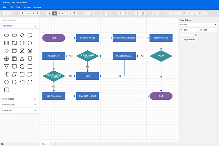
An illustration of our diagram builder application created using diagram control.
In this blog, let’s see the key features, how to get started with our diagram component, and the different modules of diagram component.
Key features
- Nodes—Nodes are one of the basic building blocks of a diagram, used to represent elements in a flowchart, steps in a process flow, employees in an organization chart, and so on.
- Built-in nodes—Most commonly used shapes for flow charts, BPMN diagrams are included with the control and you can add them in a diagram surface in a single call.
- Custom nodes—Provide an easy way to define custom nodes by providing graphical paths, images, HTML, or SVG elements.
- Interactions—Allow you to add, select, delete, resize, move, and rotate the nodes.
- Connectors—The relationship between two nodes is represented using a connector. It is one of the basic building blocks of a diagram.
- Three types of connectors are supported: straight, orthogonal, and curved (Bezier).
- Connectors can be added or edited the between nodes.
- Bridging or line jumps make it easier to relation or link when connectors overlap each other.
- Customize the start and end arrow types to indicate the flow direction with built-in decorators. You can also build your own custom decorator as required.
- Customize the appearance of a connector by changing its line style, color, thickness, etc.
- Ports—Ports represent a specific point on a node to which you can connect the connectors.
- Labels—Labels are used to annotate nodes and connectors.
- Data Binding—Data binding generates diagram with nodes and connectors based on the information provided from an external data source.
- Automatic Layout—Automatic layouts are used to arrange nodes automatically based on a predefined layout logic. There is built-in support for organizational chart layout, hierarchical tree layout, symmetric layout, radial tree layout, and mind map layout.
- Interactive features—Configure the editing experience of a diagram by allowing the user to draw the shapes or connectors continuously or once at time.
- Clipboard Operations—Cut, copy, paste, or duplicate selected objects within and across diagrams.
- Fast Editing—All the user interactions will run on the client-side, providing faster editing experience.
- Lightweight—Each independent functionality is defined as a separate module, allowing you to load webpages faster.
- Commands—Supports a set of predefined commands that help edit the diagram using the keyboard. It is also possible to configure new commands and key combinations.
- Overview Panel—The overview panel is used to improve navigation experience when exploring large diagrams.
- Symbol Palettes—The symbol palette is a gallery of reusable symbols and nodes that can be dragged and dropped on the surface of a diagram.
- Rulers—The ruler provides horizontal and vertical guides for measuring diagram objects in diagram control.
- Serialization—When saved in JSON format, a diagram’s state is persisted, and then it can be loaded back using serialization.
- Exporting—Diagrams can be exported as .PNG, .JPEG, .BMP, and .SVG image files.
- Printing—The user can print the diagram.
- Gridlines—Gridlines are the pattern of lines drawn behind diagram elements. They provide visual guidance while dragging or arranging the objects on a diagram surface.
- Page Layout—The drawing surface can be configured to a page-like appearance using page size, orientation, and margins.
- Context Menu—Frequently used commands can easily be mapped to the context menu.
- Undo and redo—Supports reverting and restoring recent changes.
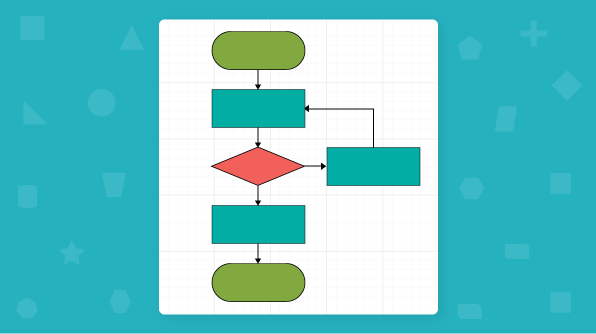
Creating a simple flow diagram
Let’s see how to create a simple flow diagram with the diagram component in a web application:
- Clone the Essential JS 2 quickstart project and install necessary packages using the following commands.
git clone https://github.com/syncfusion/ej2-quickstart.git quickstart
cd quickstart
npm install
- Dependent packages must be mapped in the system.config.js configuration file.
System.config({
    paths: {
        'syncfusion:': './node_modules/@syncfusion/',
    },
    map: {
        app: 'app',

        //Syncfusion packages mapping
        "@syncfusion/ej2-base": "syncfusion:ej2-base/dist/ej2-base.umd.min.js",
        "@syncfusion/ej2-data": "syncfusion:ej2-data/dist/ej2-data.umd.min.js",
        "@syncfusion/ej2-navigations": "syncfusion:ej2-navigations/dist/ej2-navigations.umd.min.js",
        "@syncfusion/ej2-inputs": "syncfusion:ej2-inputs/dist/ej2-inputs.umd.min.js",
        "@syncfusion/ej2-popups": "syncfusion:ej2-popups/dist/ej2-popups.umd.min.js",
        "@syncfusion/ej2-buttons": "syncfusion:ej2-buttons/dist/ej2-buttons.umd.min.js",
        "@syncfusion/ej2-lists": "syncfusion:ej2-lists/dist/ej2-lists.umd.min.js",
        "@syncfusion/ej2-splitbuttons": "syncfusion:ej2-splitbuttons/dist/ej2-splitbuttons.umd.min.js",
        "@syncfusion/ej2-diagrams": "syncfusion:ej2-diagrams/dist/ej2-diagrams.umd.min.js",
    },
    packages: {
        'app': { main: 'app', defaultExtension: 'js' }
    }
});- Add the HTML div element for the diagram into your index.html. [src/index.html]
- Essential JS 2 components support a set of built-in themes, and here we will use the Material theme for the diagram. To add the material theme in your application, you need to import material.css in style.css.
@import '../../node_modules/@syncfusion/ej2/material.css';
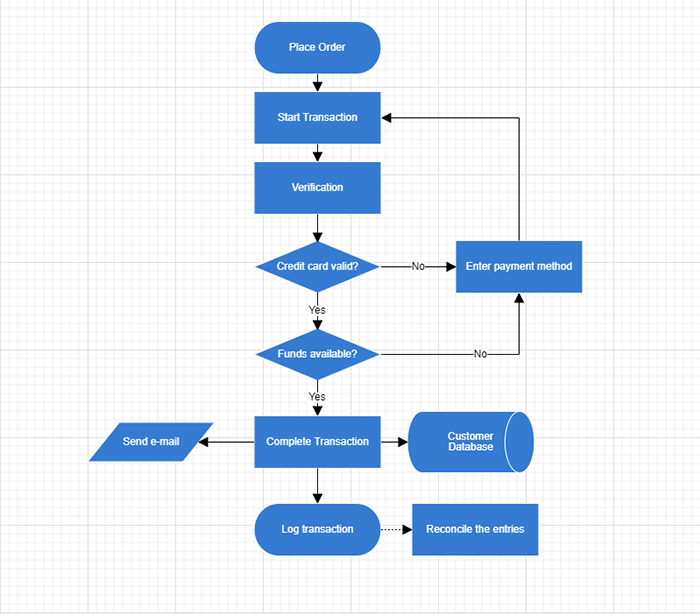
- Now, define the required nodes as (JSON data) with specific position, size, label, and shape in your app.ts[src/app/app.ts] to create a flow diagram.
import { Diagram, NodeModel, ConnectorModel } from '@syncfusion/ej2-diagrams';
//Initializes the nodes for the diagram
let nodes: NodeModel[] = [
    {
        id: 'NewIdea', height: 60, offsetX: 350, offsetY: 80,
        shape: { type: 'Flow', shape: 'Terminator' },
        annotations: [{
            content: 'Place Order'
        }]
    },
    {
        id: 'Meeting', height: 60, offsetX: 350, offsetY: 160,
        shape: { type: 'Flow', shape: 'Process' },
        annotations: [{
            content: 'Start Transaction'
        }]
    },
    {
        id: 'BoardDecision', height: 60, offsetX: 350, offsetY: 240,
        shape: { type: 'Flow', shape: 'Process' },
        annotations: [{
            content: 'Verification'
        }]
    },
    {
        id: 'Project', height: 60, offsetX: 350, offsetY: 330,
        shape: { type: 'Flow', shape: 'Decision' },
        annotations: [{
            content: 'Credit card valid?'
        }]
    },
    {
        id: 'End', height: 60, offsetX: 350, offsetY: 430,
        shape: { type: 'Flow', shape: 'Decision' },
        annotations: [{
            content: 'Funds available?'
        }]
    },
    {
        id: 'node11', height: 60, offsetX: 580, offsetY: 330,
        shape: { type: 'Flow', shape: 'Process' },
        annotations: [{
            content: 'Enter payment method'
        }]
    },
    {
        id: 'transaction_entered', height: 60, offsetX: 350, offsetY: 630,
        shape: { type: 'Flow', shape: 'Terminator' },
        annotations: [{
            content: 'Log transaction'
        }]
    },
    {
        id: 'node12', height: 60, offsetX: 530, offsetY: 630,
        shape: { type: 'Flow', shape: 'Process' },
        annotations: [{
            content: 'Reconcile the entries'
        }]
    },
    {
        id: 'transaction_completed', height: 60, offsetX: 350, offsetY: 530,
        shape: { type: 'Flow', shape: 'Process' },
        annotations: [{
            content: 'Complete Transaction'
        }]
    },
    {
        id: 'Data', height: 45, offsetX: 150, offsetY: 530,
        shape: { type: 'Flow', shape: 'Data' },
        annotations: [{
            content: 'Send e-mail', margin: { left: 25, right: 25 }
        }]
    },
    {
        id: 'node10', height: 70, offsetX: 525, offsetY: 530,
        shape: { type: 'Flow', shape: 'DirectData' },
        annotations: [{
            content: 'Customer Database', margin: { left: 25, right: 25 }
        }]
    }
];
- Add connectors to establish the relationship among these nodes.
//Initializes the connector for the diagram
let connectors: ConnectorModel[] = [
    {
        id: 'connector1', sourceID: 'NewIdea', targetID: 'Meeting'
    },
    {
        id: 'connector2', sourceID: 'Meeting', targetID: 'BoardDecision'
    },
    {
        id: 'connector3', sourceID: 'BoardDecision', targetID: 'Project'
    },
    {
        id: 'connector4', sourceID: 'Project', targetID: 'End',
        annotations: [
            { content: 'Yes', style: { fill: 'white' } }
        ]
    },
    {
        id: 'connector5', sourceID: 'End', targetID: 'transaction_completed',
        annotations: [
            { content: 'Yes', style: { fill: 'white' } }
        ]
    },
    {
        id: 'connector6', sourceID: 'transaction_completed', targetID: 'transaction_entered'
    },
    {
        id: 'connector7', sourceID: 'transaction_completed', targetID: 'Data'
    },
    {
        id: 'connector8', sourceID: 'transaction_completed', targetID: 'node10'
    },
    {
        id: 'connector9', sourceID: 'node11', targetID: 'Meeting',
        segments: [
            { direction: 'Top', length: 120 }
        ]
    },
    {
        id: 'connector10', sourceID: 'End', targetID: 'node11',
        annotations: [
            { content: 'No', style: { fill: 'white' } }
        ],
        segments: [
            { direction: 'Right', length: 100 }
        ]
    },
    {
        id: 'connector11', sourceID: 'Project', targetID: 'node11',
        annotations: [
            { content: 'No', style: { fill: 'white' } }
        ]
    },
    {
        id: 'connector12', sourceID: 'transaction_entered', targetID: 'node12',
        style: { strokeDashArray: '2,2' }
    }
];
- Default values for all nodes and connectors can be set using the getNodeDefaults and getConnectorDefaults properties, respectively. For example, if all nodes have the same width and height, such properties can be moved into getNodeDefaults.
- Now map the nodes and connectors into the diagram class.
//Initializes diagram control
let diagram: Diagram = new Diagram({
    width: '100%', height: '700px', nodes: nodes, connectors: connectors,
    //Sets the default values of a node
    getNodeDefaults: (node: NodeModel) => {
        let obj: NodeModel = {};
        obj.width = 145;
        obj.style = { fill: '#357BD2', strokeColor: 'white' };
        obj.annotations = [{
            style: {
                color: 'white',
                fill: 'transparent'
            }
        }];
        return obj;
    },
    //Sets the default values of a connector
    getConnectorDefaults: (obj: ConnectorModel) => {
        if (obj.id.indexOf('connector') !== -1) {
            obj.type = 'Orthogonal';
            obj.targetDecorator = { shape: 'Arrow', width: 10, height: 10 };
        }
    },
});
diagram.appendTo('#container');
- Run the following command to start the application.
npm start
The output will be shown like below.
Diagram—Modules
The diagram component is divided into individual modules by feature. To use a particular feature, inject the required module. The following list describes the modules:
- BpmnDiagrams—Inject this module to add built-in BPMN shapes to diagrams.
- ConnectorBridging—Inject this module to add bridges or line caps to connectors.
- ConnectorEditing—This module allows you to edit the segments for connectors.
- ComplexHierarchicalTree—This module allows you to create complex hierarchical tree-like structures.
- DataBinding—This module allows you to populate diagram from a given data source.
- DiagramContextMenu—This module allows you to manipulate the diagram using the context menu.
- HierarchicalTree—This module allows you to create a hierarchical tree-like structure.
- LayoutAnimation—Inject this module to add animation effects to automatic layout diagrams.
- MindMap—This module allows you to create mind map diagrams.
- PrintAndExport—This module allows you to print or export the diagram elements.
- RadialTree—This module allows you to create radial tree-like structures.
- Snapping—This module allows you to snap the diagram elements with gridlines.
- SymmetricLayout—This module renders diagram elements in a symmetrical layout.
- UndoRedo—Inject this module to revert and restore changes.
Summary
Overall, the JavaScript diagram control can be used to create flow charts, organization charts, mind maps, and BPMN diagrams. It has flexible usage from the application point of view. It was designed to be completely modularized to ensure loading speed.
If you would like to try the diagram component, you can download our free trial. You can visit the diagram source in GitHub and you can check our sample browser and documentation for detailed explanations and the knowledge to proceed further.
If you have any questions or need any clarifications, please let us know in the comments section below. You can also contact us through our support forum or Direct-Trac. We are always happy to assist you!
If you like this blog post, we think you’ll also like the following free e-books:
JavaScript Succinctly
TypeScript Succinctly
AngularJS Succinctly
Angular 2 Succinctly