
Dashboards are very useful to track strategic data, key performance indicators, and important metrics from several data sources and visually present them. But designing a dashboard is a challenging job when you need features that let users place components, drag-and-drop, resize, and reorder. You’ll also need to present the dashboard with a responsive and adaptive layout, so it can be viewed at any resolution in any device without data loss.
Considering all these challenges, the Syncfusion Dashboard Layout component was implemented. It will create a dynamic dashboard quickly with the expected layout and allow you to think about only the data integration and projection.
You can place the component in a grid-structured layout at a desired place and design the layout by live-editing the panels with the help of reordering, drag and drop, resizing, add new, and removing functionalities.
Let’s try making a dashboard as shown in the following screenshot by using the Dashboard Layout component.
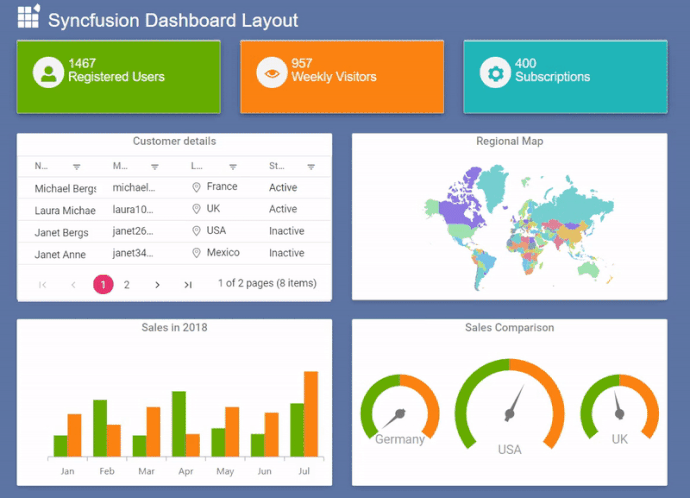
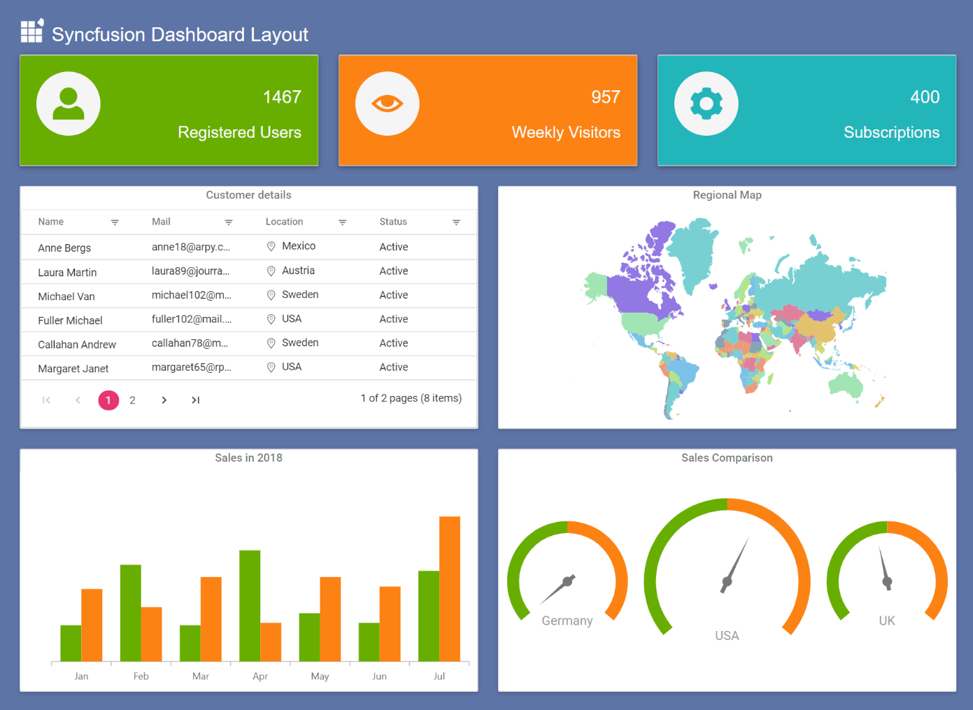 A simple dashboard with Grid, Chart and Map components.
You can get the demo sample from the GitHub repository: How to create a dynamic and responsive dashboard
Initialize the Dashboard Layout component
The list of dependencies required to render the Dashboard Layout component are as follows.
|– @syncfusion/ej2-layouts
|– @syncfusion/ej2-base
To use the Dashboard Layout component, we need to import it from the @syncfusion/ej2-layouts packages from the npm and append it to an element as shown in the following code example.
[index.ts]
//importing DashboardLayout from ej2-layouts
import { DashboardLayout } from '@syncfusion/ej2-layouts';

let dashboard: DashboardLayout = new DashboardLayout({});

dashboard.appendTo('#editLayout');
[index.html]
<!-- dashboard layout element -->

<div id="editLayout"></div>
Creating panels
Panels are the building blocks of the Dashboard Layout component. It holds the data (components) to be visualized or presented. It has options to resize, reorder, or position a component in the desired manner. Configure the panels to place inside the dashboard as shown in the following code example.
[index.ts]
let dashboard: DashboardLayout = new DashboardLayout({
//splits the entire width of the component into 6 equal columns.
columns: 6,
//defines the width/height ratio of each panel, here panel height will be 10/8 of its width value.
cellAspectRatio: 100 / 80,
//adding panel properties.
panels: [

{'sizeX': 2, 'sizeY': 1, 'row': 0, 'col': 0 },

{'sizeX':2, 'sizeY': 1, 'row': 0, 'col': 2 },

{'sizeX': 2, 'sizeY': 1, 'row': 0, 'col': 4 },

{'sizeX': 3, 'sizeY': 2, 'row': 1, 'col': 0 },

{'sizeX': 3, 'sizeY': 2, 'row': 1, 'col': 3 },

{'sizeX': 3, 'sizeY': 2, 'row': 4, 'col': 0 },

{'sizeX': 3, 'sizeY': 2, 'row': 4, 'col': 3 },

]});

dashboard.appendTo('#editLayout');
In the above code block, columns and cellAspectRatio properties defines the panel dimensions (height and width of each panel) to represent the number columns and panels placed in each row. In addition, you can turn on the panel resize option to enhance further live designing.
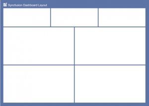 Dashboard layout with empty panels
Adding components with header information to panels
In the Dashboard Layout components, Panels has options to define the header and content with complete customization. Header holds the supplemental data and also any action items like buttons or menu. The content of the panels can adopt any data or even data visualizing component such as chart or gauge or map. Refer to the following code example to add header and content to panels.
[index.ts]
import { enableRipple } from '@syncfusion/ej2-base';

import { DashboardLayout } from '@syncfusion/ej2-layouts';

import { CircularGauge } from '@syncfusion/ej2-circulargauge';

import { gauge1, gauge2, gauge3 } from './gauge-component';

import { Grid } from '@syncfusion/ej2-grids';
// importing grid component.
import { gridComponent } from './grid-component';

import { Maps} from '@syncfusion/ej2-maps';
// importing map component.
import { mapsComponent } from './map-component';

import { Chart, Legend, Tooltip, ColumnSeries, Category, DataLabel } from '@syncfusion/ej2-charts';
// importing column chart.
import { columnChartComponent } from './chart-component';

Chart.Inject(ColumnSeries, DataLabel, Category, Legend, Tooltip);

enableRipple(true);
// initializing DashboardLayout component.
let dashboard: DashboardLayout = new DashboardLayout({

columns: 5,

cellSpacing: [25, 25],

cellAspectRatio: 100 / 80,

panels: [
{
'sizeX': 2, 'sizeY': 1, 'row': 0, 'col': 0, cssClass: 'card-template', content: '#card1'
},
{
'sizeX': 2, 'sizeY': 1, 'row': 0, 'col': 2, cssClass: 'card-template', content: '#card2'
},
{
'sizeX': 2, 'sizeY': 1, 'row': 0, 'col': 4, cssClass: 'card-template', content: '#card3'
},
{
'sizeX': 3, 'sizeY': 2, 'row': 1, 'col': 0,
header: '<div> Customer details</div>', content: '<div id="Grid"></div>'
},
{
'sizeX': 3, 'sizeY': 2, 'row': 1, 'col': 3,
header: '<div>Regional Map</div>', content: '<div id="map"></div>'
},
{
'sizeX': 3, 'sizeY': 2, 'row': 4, 'col': 0,
header: '<div>Sales in 2018 </div>', content: '<div id="colChart"></div>'
},
{
'sizeX': 3, 'sizeY': 2, 'row': 4, 'col': 3,
header: '<div> Sales Comparison </div>', content: '#card4'
}
]});

dashboard.appendTo('#editLayout');
// initializing gauge components.
let germany: CircularGauge = new CircularGauge(gauge1(), '#container1');

let usa: CircularGauge = new CircularGauge(gauge2(), '#container2');

let uk: CircularGauge = new CircularGauge(gauge3(), '#container3');
// initializing chart component.
let chart: Chart = new Chart (columnChartComponent(),'#colChart');
// initializing grid component.
let grid: Grid = new Grid(gridComponent(),'#Grid');
// intitalizing map component.
let map: Maps = new Maps(mapsComponent(), "#map");
Here the first row of panel contains the HTML template cards. Then the grid component is initialized and rendered by obtaining the model values from the grid-component.ts file.
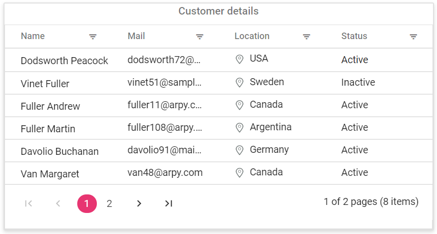 Grid inside the panel
Similarly, the other components, chart, maps, and gauge, are also imported from the chart-component.ts, map-component.ts, and gauge-component.ts files, respectively.
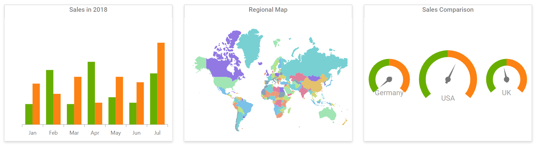 Chart, Map and Circular gauge inside the panels
Finally, you will get a simple dashboard with cards, grid, chart, gauges and map as shown in below screenshot with editable layout.
A simple dashboard with Grid, Chart and Map components
Redesign the layout to a different structure by live editing the dashboard as like below.
 Dashboard with live editing
Conclusion
We hope this blog and the sample shared help you design a dynamic dashboard with grids, charts, and gauges using the Dashboard Layout component. The Dashboard Layout is also available in Angular, React, Vue, ASP.NET MVC and ASP.NET Core framework, so you can try out the sample based on your preferred one.
To learn more about the Dashboard Layout component, refer to the Syncfusion online samples and documentation. We look forward to you trying this component and providing your feedback through this feedback portal. You can also contact us through our support forum or Direct-Trac. We are happy to assist you!


Comments (2)
This is a topic that is near to my heart… Many thanks! Where
are your contact details though?
Hi Chante,
You can contact us through our support forum or Direct-Trac. We are happy to assist you!
Thanks,
Suresh
Comments are closed.