
Responsiveness is an approach to shrink web pages based on device width. This technique plays a key role in modern web applications to help users view the most important parts of a web page and to simplify interaction in different form factors. As per a Statista report, mobile phone and tablet users are increasing rapidly year by year. This report clearly shows that responsiveness is going to be an important factor in developing web applications.
In web applications, a grid is a vital component for displaying data in a tabular structure, but achieving responsiveness in a grid is cumbersome. Fortunately, the Syncfusion Angular grid component provides built-in responsive support.
Note: All the features and information in this blog are applicable to our other Essential JS 2 frameworks for React, Vue, ASP.NET Core, ASP.NET MVC, and JavaScript.
In this blog, we are going to explain how to utilize the responsiveness feature of the Angular grid. Before starting, you can download a starter grid sample from this GitHub repository and also check out this overview blog.
Before starting
To download the sample from GitHub, use the following command.
git clone https://github.com/SyncfusionSamples/ej2-angular-grid-simple.git
cd ej2-angular-grid-simple
Once all the files are downloaded, you can install packages related to Angular and the grid by using the following command.
npm install
Built-in responsive features
From the initial stage of development, we focused on giving all features in the grid a responsive nature. The grid has many advanced features such as sorting, paging, filtering, grouping, CRUD, virtual scrolling, and more. These advanced features are responsive in nature and work very well on different devices.
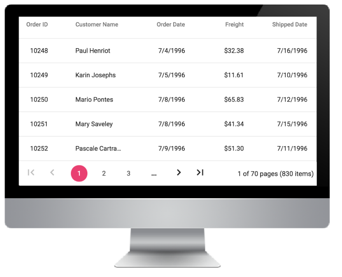
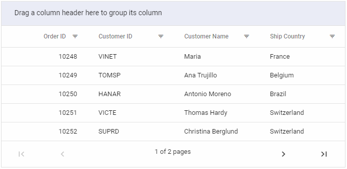
Angular grid on Desktop device
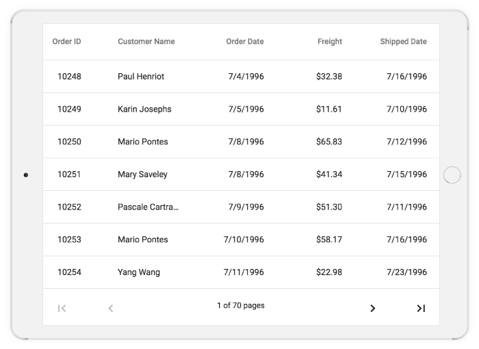
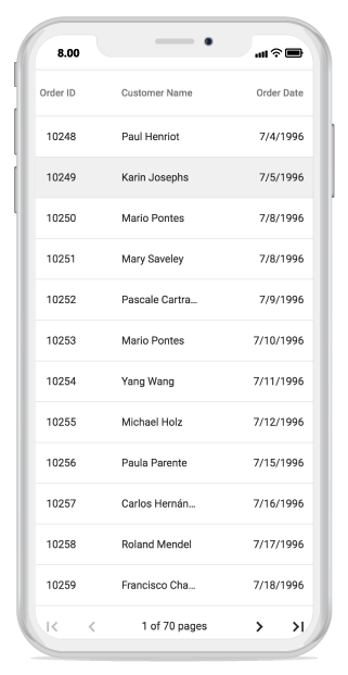
In the previous images, you can clearly see how the grid adapts to different form factors. In desktop view, the grid adapts with a horizontal layout and occupies the entire parent width along with the pager. In tablet view, a horizontal scroll bar is provided to make the grid more readable, and the pager’s design is changed to include previous and next buttons. The same occurs for mobile view: the grid and its pager adapt to a small view. You can check out the responsiveness of different features in our Angular grid by visiting our grid demos on different devices.
Hiding columns based on browser width
In our responsive grid technique, one of the most commonly used approaches is hiding columns based on browser width. For this, first we have to mark priority for individual columns. After that, we need to define CSS to hide columns in Media Queries. In our Essential JS 2 grid, we have simplified this approach and introduced a new property called hideAtMedia which accepts Media Queries once the given condition is satisfied. The grid will then hide the specified columns.
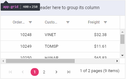
In the cloned demo application, we are going to define hideAtMedia with (min-width: 700px) for the Freight column as shown in the following file, grid.component.html. After that, if we resize the browser below 700 pixels, then the specified columns will be hidden.
  <ejs-grid [dataSource]='data' [allowPaging]='true' [allowSorting]='true'[allowFiltering]='true'
   [allowGrouping]='true' [filterSettings]='filterSettings' [pageSettings]="pageSettings">
    <e-columns>
      <e-column field='OrderID' headerText='Order ID' textAlign='Right' width=120></e-column>
      <e-column field='CustomerID' headerText='Customer ID' width=120></e-column>
      <e-column field='Freight' textAlign='Right' format='c2' hideAtMedia='(min-width: 700px)' width=120></e-column>
      <e-column field='CustomerName' headerText='Customer Name' hideAtMedia='(min-width: 500px)' width=120></e-column>
      <e-column field='ShipCountry' headerText='Ship Country'  width=120></e-column>
    </e-columns>
  </ejs-grid>
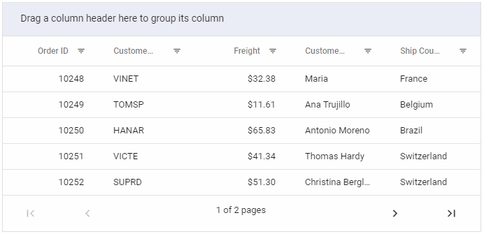
Grid in browser with width greater than 700 px
Grid in browser with width less than 700 px
Adapt within parent container
Sometimes we will have scenarios where we need to place the entire grid inside a parent element without affecting its height and width; for example, placing the grid inside a card component in dashboard applications. To do this, we need to define the height and width for the parent container and then define the grid height and width as 100%. In the following code sample, we define the parent container for app-grid in app.component.html.
Here we have defined width and height as 100% in grid.component.html.
  <ejs-grid [dataSource]='data' [allowPaging]='true' [allowSorting]='true' width='100%' height='100%' [allowFiltering]='true'
   [allowGrouping]='true' [filterSettings]='filterSettings' [pageSettings]="pageSettings">
    <e-columns>
      <e-column field='OrderID' headerText='Order ID' textAlign='Right' width=120></e-column>
      <e-column field='CustomerID' headerText='Customer ID' width=120></e-column>
      <e-column field='Freight' textAlign='Right' format='c2' hideAtMedia='(min-width: 700px)' width=120></e-column>
      <e-column field='CustomerName' headerText='Customer Name' hideAtMedia='(min-width: 500px)' width=120></e-column>
      <e-column field='ShipCountry' headerText='Ship Country'  width=120></e-column>
    </e-columns>
  </ejs-grid>
After applying the parent container, the grid will adapt to its container.
Grid within parent container
Summary
In this blog we looked at the built-in responsive features and common responsive techniques in our Essential JS 2 grid component, such as hiding columns based on browser width and adapting to fit a parent container. These details will be helpful when developing an application with responsiveness in mind. Also, you can check out the responsive behavior explained in this blog in our GitHub repository, which is readily runnable.
Want to check out other features of our Angular grid? Visit the Angular grid component features page, the source in GitHub, other demos, and our documentation to explore more live samples of its features and API.
If you have any questions, please let us know in the comments section below. You can also contact us through our support forum or Direct-Trac. We are happy to assist you!
If you like this blog post, we think you’ll also like the following free e-books: