Investors and analysts typically analyze the price movement of any stock before investing in it, so the graphical representation of this trend makes analysis easier. The chart and range navigator play a key role in tracking and visualizing the stock price of a company over a specific period. In this blog, we’ll walk through how to represent stock analysis with Syncfusion angular charts and range navigator controls for Angular.
Before getting deep into the topic, let us go through the overview of the basic functionalities available in angular charts and range navigator.
Overview
Stunning visualization and analysis of data can be performed using the rich feature set available in our angular charts component. Our angular charts supports 25 types of chart with user interactivity like zooming, tooltip, selection etc. The angular range navigator provides the ability to select a small range of data from a large collection. In another way, range navigator helps to zoom the data in the main chart area. Both components play a key role in financial dashboards to filter and visualize data over a specific period.
Module injection
Module injection is useful when you want to keep your app lightweight, since all the features in Syncfusion angular charts and range navigator are modularized and available as separate services, you can use only the modules you need for your app. For example, when you want to visualize your financial data with a candle chart, injecting CandleSeriesService in the providers is enough.
Customizing stock dashboard
Let’s create a dashboard to visualize and compare the stock prices of different companies like GOOG, AAPL, GOOGL, AMZN and TSLA for the period 2012 – 2015. We’ll visualize the price of these stocks using different types of series such as candle, hollow candle, line, hilo, HiLoOpenClose, and spline.
In addition to this, we are going to add indicators and trendlines for this data to analyze the past and predict the future market trends based on historic price, volume, and open interest.
To help you select and visualize data for different periods, a period selector feature is included in the sample. Other than these functionalities, we also have options to print and export the report for further use.
Getting started
To create an Angular application, install the Angular CLI globally using the following command.
 npm install -g @angular-cli
 ng new my-app
After the Angular application has been created, use the following command to install the chart package which includes both the chart and range navigator component.
 cd my-app
 npm install @syncfusion/ej2-ng-charts --save
Now create an Angular component to render the chart and range navigator.
F:\Development\Blogs\my-app>ng generate component chart
Next, import the chart and range navigator module in the app.module.ts file.
import { BrowserModule } from '@angular/platform-browser';
import { NgModule } from '@angular/core';
import { AppComponent } from './app.component';
import { ChartComponent } from './chart/chart.component';
//ej2 Chart module
import { ChartAllModule, RangeNavigatorAllModule} from '@syncfusion/ej2-ng-charts';

@NgModule ({
  declarations: [ AppComponent,ChartComponent  ],
  imports: [ BrowserModule, ChartAllModule, RangeNavigatorAllModule],
  bootstrap: [AppComponent]
})
export class AppModule { }
Initialize the chart and range navigator component in chart.component.html file.
<ejs-rangenavigator> </ejs-rangenavigator>
<ejs-chart> </ejs-chart>
Populating required data
First, let’s visualize the stock price of GOOG with candle and column series on initial loading. Define the CandleSeriesService and ColumnSeriesService in the providers of the app.module.ts file.
 import { CandleSeriesService, ColumnSeriesService } from '@syncfusion/ej2-ng-charts/src/chart/chart.component';
@NgModule ({
  providers: [CandleSeriesService, ColumnSeriesService],
})
export class AppModule { }
Then, add JSON data for the stock price of the company to your application and assign it to the dataSource property in the series.
public stockData: object[] = [
    { x: new Date("2012-04-02"), open: 85.975716, high: 88.395714, low: 85.76857, close: 88.375717, volume: 14958790 },
    { x: new Date("2012-04-03"), open: 89.614288, high: 90.315712, low: 88.93, close: 89.902855, volume: 20863990 },
    { x: new Date("2012-04-04"), open: 89.192856, high: 89.408569, low: 88.14286, close: 89.187141, volume: 14324520 },
    { x: new Date("2012-04-05"), open: 89.568573, high: 90.665718, low: 89.057144, close: 90.525711, volume: 16032450 },
    { x: new Date("2012-04-09"), open: 89.447144, high: 91.405716, low: 89.328575, close: 90.889999, volume: 14938420 },
    { x: new Date("2012-04-10"), open: 91.418571, high: 92, low: 89.428574, close: 89.777145, volume: 22243130 },
]
<ejs-chart id="chart-container" [primaryXAxis] = 'primaryXAxis' > <e-series-collection> <e-series [dataSource]='stockData' yAxisName='secondary' width='2' type='Column' xName='x' yName='volumn'> </e-series> <e-series [dataSource]='stockData' width='2' type='Candle' xName='x' yName='close' high='high' low='low' open='open' close='close' volume='volume' name='Apple Inc' bearFillColor='#2ecd71' bullFillColor='#e74c3d'> </e-series> </e-series-collection> <ejs-chart>
Since we are going to show the volume in separate row, we need to customize the axes and rows of chart as below.
export class AppComponent implements OnInit {
  public primaryXAxis: Object;
  public primaryYAxis: Object;
  public rows: Object;
  public axes: Object;
  ngOnInit(): void {
   this.primaryYAxis = {
        plotOffset: 25,
        rowIndex: 1, opposedPosition: true,
        rangePadding: 'None',
    };
   this.primaryXAxis = { valueType: 'DateTime' };
   this.rows = [
     { height: '15%' },
     { height: '85%' }
   ];
   this.axes = [{
    name: 'secondary', opposedPosition: true, rowIndex: 0,
   }];
 }
}
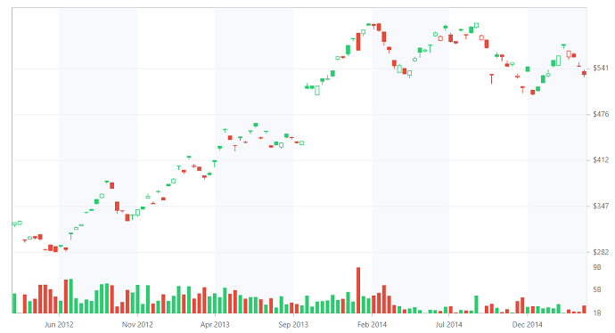
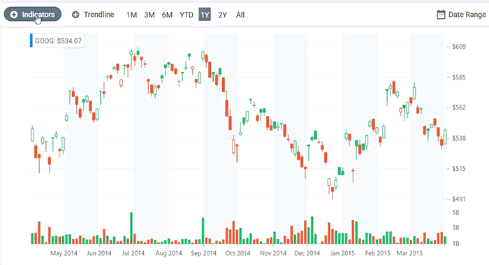
After adding series, the chart will appear as shown in the following screenshot.
Period selector
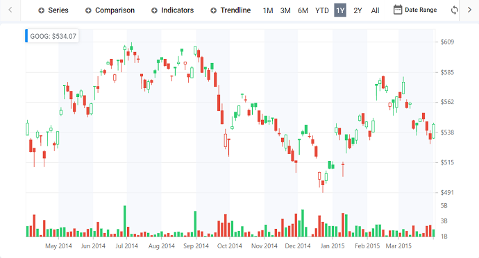
Using the previous code snippet, the stock price details for the company GOOG have been visualized. Now you can select data for a specific period using the period selector feature in the range navigator. You can access this functionality by injecting the PeriodSelector in the providers and enabling the disableRangeSelector property in the range navigator.
import { ChartModule } from '@syncfusion/ej2-ng-charts';
import { PeriodSelector } from '@syncfusion/ej2-ng-charts';
  @NgModule({
  imports: [ BrowserModule, ChartModule ],
  providers: [PeriodSelector]
 })
Now assign the GOOG data to the dataSource property in the range navigator and define the periods for which you want to visualize data.
` <ejs-rangenavigator valueType='DateTime' (changed)='rangeChanged($event)'
   disableRangeSelector=true [dataSource]='stockData' xName='x' yName='close' [periodSelectorSettings]='periods'>
  </ejs-rangenavigator>`
export class AppComponent implements OnInit {
  public periods: Object;
  ngOnInit(): void {
  this.periods = {
        position: 'Top',
        periods: [{ text: '1M', interval: 1, intervalType: 'Months' },
                 { text: '3M', interval: 3, intervalType: 'Months' },
                 { text: '6M', interval: 6, intervalType: 'Months' },
                 { text: 'YTD' },
                 { text: '1Y', interval: 1, intervalType: 'Years' },
                 { text: '2Y', interval: 2, intervalType: 'Years' },
                 { text: 'All' }]
     };
  }
}
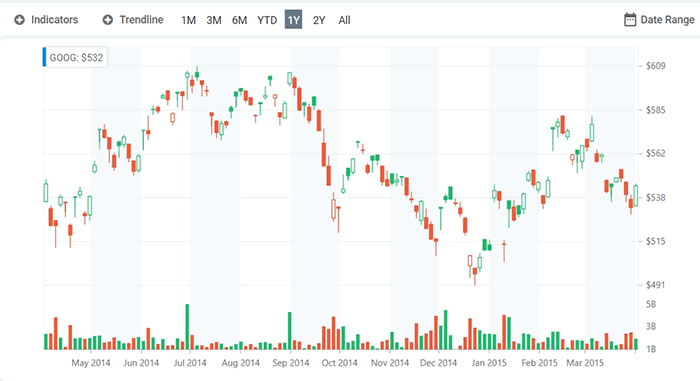
After enabling the period selector, the range navigator will appear as shown in the following screenshot. You can now interact with the periods in the range navigator to select data.
Adding indicators and trendlines
You can add indicators and trendlines to the plotted data to analyze the past and predict future market trends based on the price, volume, or open interest. Using the selectorRender event, you can add custom elements to the period selector in the range navigator.
<ejs-rangenavigator (selectorRender)='selectorRender($event)'>
</ejs-rangenavigator>
export class AppComponent implements OnInit {
ngOnInit(): void {
this.selectorRender = (args: IRangeSelectorRenderEventArgs) => {
let indicatorModel: ItemModel = {
template: ' ', align: 'Left'
};
let trendLineModel: ItemModel = {
template: ' ', align: 'Left'
};
args.selector.splice(0, 0, trendLineModel);
args.selector.splice(0, 0, indicatorModel);
};
}
}
Now, let’s customize the elements in the loaded event of the range navigator with a drop-down list to show the indicator and trend line types available in the chart. Using the changed event of the drop-down, you can add selected indicators and trend lines to the chart dynamically.
<ejs-rangenavigator (loaded)='rangeLoaded($event)' >
</ejs-rangenavigator>
export class AppComponent implements OnInit {
  ngOnInit(): void {
      this.rangeLoaded = (args: IRangeLoadedEventArgs) => {
       let indicatorType: DropDownButton = new DropDownButton({
         items: [{ text: 'TMA' }, { text: 'Bollinger Bands' }, { text: 'RSI' }, { text: 'SMA' },
         { text: 'MACD' }],
         iconCss: 'e-icons e-add', cssClass: 'e-caret-hide',
         select: (args: MenuEventArgs) => {
              this.indicators.push(type);
              this.chart.indicators = this.chart.indicators.concat(indicator);
              this.chart.refresh();
        },
      });
     indicatorType.appendTo('#indicatorType');
     let trendType: DropDownButton = new DropDownButton({
        items: [{ text: 'Linear' }, { text: 'Polynomial' }, { text: 'MovingAverage' }],
        select: (args: MenuEventArgs) => {
          let type: TrendlineTypes = args.item.text;
          this.chart.series[1].trendlines[0].animation.enable = false;
          this.chart.series[1].trendlines[0].width = 3;
          this.chart.series[1].trendlines[0].type = type;
          this.chart.refresh();
        },
        iconCss: 'e-icons e-add', cssClass: 'e-caret-hide'
      });
      trendType.appendTo('#trendType');
   }
  }
 }
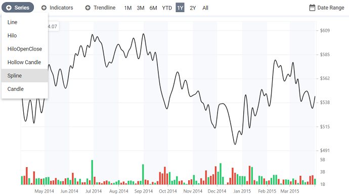
Adding different series types
You can view stock data with different series types available in the chart. For example, if you want to view the close price of the stock, use line or spline series by binding the close value of the stock to the yName property in the series. The HiLo series can be used to represent the high and low values of a stock for a specific period.
Using the selectorRender event, you can add a dropdown in the period selector to list the series types. Using the changed event of the drop-down, you can change the series type dynamically.
<ejs-rangenavigator (selectorRender)='selectorRender($event)' (loaded)='rangeLoaded($event)'>
</ejs-rangenavigator>
export class AppComponent implements OnInit {
ngOnInit(): void {
this.selectorRender = (args: IRangeSelectorRenderEventArgs) => {
let seriesModel: ItemModel = {
template: ' ', align: 'Left'
};
args.selector.splice(0, 0, seriesModel);
};
}
this.rangeLoaded = (args: IRangeLoadedEventArgs) => {
let seriesType: DropDownButton = new DropDownButton({
items: [{ text: 'Line' }, { text: 'Hilo' }, { text: 'HiloOpenClose' },
{ text: 'Hollow Candle' }, { text: 'Spline' }, { text: 'Candle' }],
select: (args: MenuEventArgs) => {
if (args.item.text === 'Candle') {
this.chart.series[1].enableSolidCandles = true;
this.chart.series[1].type = 'Candle';
} else if (args.item.text === 'Hollow Candle') {
this.chart.series[1].enableSolidCandles = false;
this.chart.series[1].type = 'Candle';
} else {
this.chart.series[1].type = args.item.text;
}
this.chart.refresh();
},
});
seriesType.appendTo('#seriesType');
}
}
}
Change the series type from candle to spline, to view the closed price of stock.
Adding user interaction
To track the details about a stock price over a period or range, use the crosshair and zooming features. With these features, you can hover over any region in the chart to display the stock value of the company in an annotation with respect to the date. You can also zoom in and out of the chart using the mouse wheel to view set of data.
<ejs-chart #chart id='chartStock' [tooltip]='tooltip' [crosshair]='crosshair' (tooltipRender)='tooltipRender($event)' [zoomSettings]='zoomSettings'>
<e-annotations>
<e-annotation content='<div class="e-annotation"id="annotation"></div>' coordinateUnits='Pixel' region='Chart' x='3%' y='12%'
verticalAlignment='Bottom' horizontalAlignment='Far'>
</e-annotation>
</e-annotations>
</ejs-chart>`
export class AppComponent implements OnInit {
    ngOnInit(): void {
      this.primaryYAxis = {
         crosshairTooltip: { enable: true },
      }
      this.primaryXAxis = {
         crosshairTooltip: { enable: true },
      }
      this.tooltip = { enable: true, shared: true, header: '',
                       format: '${point.x} High : ${point.high} Low :' +
                               '${point.low} Open : ${point.open} Close :' +
                               '${point.close} Volume : ${point.volume}'
      };
     this.zoomSettings = { enableMouseWheelZooming: true, mode: 'X', toolbarItems: [] };
     }
Customization
After setting the trend lines, indicators, and scope for the chart, the final thing to do is to export or print it. To do so, add a button in the period selector’s click event to print or export the chart as shown in the following code.
<ejs-rangenavigator (selectorRender)='selectorRender($event)' (loaded)='rangeLoaded($event)'>
</ejs-rangenavigator>
export class AppComponent implements OnInit {
  ngOnInit(): void {
     this.selectorRender = (args: IRangeSelectorRenderEventArgs) => {
       let printModel: ItemModel = {
        template: ' ', align: 'Right', tooltipText: 'Print'
        };
       let exportModel: ItemModel = {
        template: ' ', align: 'Right', tooltipText: 'Export'
       };
       args.selector.push(printModel);
       args.selector.push(exportModel);
    };
   this.rangeLoaded = (args: IRangeLoadedEventArgs) => {
      let print: Button = new Button({
        iconCss: 'e-icons e-play-icon', cssClass: 'e-flat'
      });
      print.appendTo('#print');
      document.getElementById('print').onclick = () => {
      this.chart.print(['chartStock']);
   };
 }
}
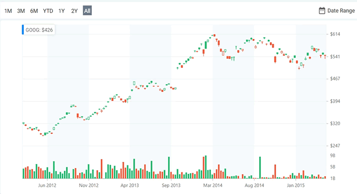
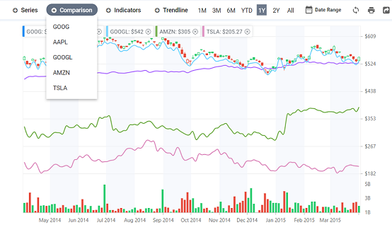
In the previous code example, GOOG data is used to represent the stock price of the company. You can also plot data of other companies dynamically and compare their stock values in a single view using the period selector element. In the following screenshot, we have shown the close price of other companies – AAPL, GOOGL, AMZN and TSLA- using line series.
Summary
In this blog post, we saw how to use and customize built-in features of the chart and range navigator controls to create a stock chart. We hope you enjoyed it and stay tune to read the posts like this on how to customize Syncfusion controls for real-world application.
We recommend checking out the chart and range navigator components for yourself through the source code available on GitHub, the interactive sample browser, and the documentation to explore all of the features and APIs. Also, be sure to check out the stock chart on GitHub, which is readily runnable to see just how easy it is to create and configure charts.
If you have any questions or comments, please let us know in the comments below. You can also contact us through our support forum or Direct-Trac. We are always happy to assist you!
If you like this blog post, we think you’ll also like the following free e-books:
JavaScript Succinctly
ECMAScript 6 Succinctly
AngularJS Succinctly
Angular 2 Succinctly


Comments (3)
I was wondering if the stock charts can render real time data.
Also this is a Wonderful angular plugin , a true work of art !
HI Harold,
Yes. We can show the real-time data in our stock chart. The above stock chart is created with the help of chart and toolbar components, but Syncfusion has now implemented stock chart as a separate component.
Please check the samples below.
https://ej2.syncfusion.com/angular/demos/#/material/stock-chart/ohlc
We have created a simple live update in stock chart. Please check the demo below.
https://stackblitz.com/edit/angular-npuxey-fqzvdr?file=app.component.ts
Wow thanks ! The demo is exactly what I was looking for . 10/10
Comments are closed.