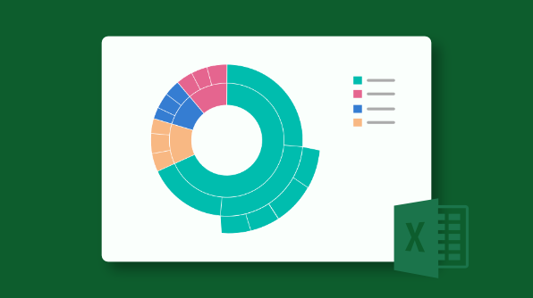
Microsoft Excel 2016 introduced new chart types for exploring and quickly visualizing common financial, statistical, and hierarchical data. These new charts are:
· Waterfall
· Histogram
· Pareto
· Box and whisker
· Tree map
· Sunburst
· Funnel
Essential XlsIO, our file-format manipulation library, supports creating and editing these new chart types from version 14.3 onwards. These chart types can be converted to images and exported to PDF.
In this blog post we’ll see how to create each of these new chart types in C#.
Waterfall chart
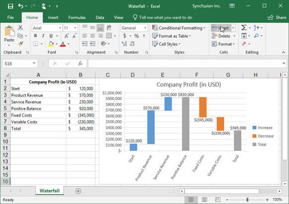
A waterfall chart helps viewers quickly understand the finances of business owners by visualizing profit and loss statements. With a waterfall chart, you can quickly illustrate the line items in your financial data and get a clear picture of how each item is impacting your bottom line.
A complete sample that creates a waterfall chart can be downloaded here.
The example shows the income statement of a company where the incomes and expenses are listed and visualized in the chart. Among the expenses, it is clear to see that the fixed costs cut most of the net revenue.
The following code example illustrates how to create a waterfall chart in C# using XlsIO.
using (ExcelEngine excelEngine = new ExcelEngine())
{
IApplication application = excelEngine.Excel;
application.DefaultVersion = ExcelVersion.Excel2016;
IWorkbook workbook = application.Workbooks.Open(“Sample.xlsx”, ExcelOpenType.Automatic);
IWorksheet sheet = workbook.Worksheets[0];
IChartShape chart = sheet.Charts.Add();
//Set chart type as waterfall
chart.ChartType = ExcelChartType.WaterFall;
//Set data range to the chart from the worksheet
chart.DataRange = sheet[“A2:B8”];
//Data point settings as total in chart
chart.Series[0].DataPoints[3].SetAsTotal = true;
chart.Series[0].DataPoints[6].SetAsTotal = true;
//Showing the connector lines between data points
chart.Series[0].SerieFormat.ShowConnectorLines = true;
//Set the chart title
chart.ChartTitle = “Company Profit (in USD)”;
//Formatting data label and legend option
chart.Series[0].DataPoints.DefaultDataPoint.DataLabels.IsValue = true;
chart.Series[0].DataPoints.DefaultDataPoint.DataLabels.Size = 8;
chart.Legend.Position = ExcelLegendPosition.Right;
workbook.SaveAs(“Waterfall.xlsx”);
}
Histogram
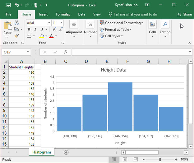
A histogram is a column chart that shows the frequency of value appears within a distribution. Each column of the chart is called a bin, which can be changed further to analyze the data.
A complete sample that creates a histogram can be downloaded here.
The example shows the data frequency across the heights of students. Here, the horizontal axis represents the height. Each column shows the number of students within a given height range.
The following code example illustrates how to create a histogram in C# using XlsIO.
using (ExcelEngine excelEngine = new ExcelEngine())
{
IApplication application = excelEngine.Excel;
application.DefaultVersion = ExcelVersion.Excel2016;
IWorkbook workbook = application.Workbooks.Open(“Sample.xlsx”, ExcelOpenType.Automatic);
IWorksheet sheet = workbook.Worksheets[0];
IChartShape chart = sheet.Charts.Add();
//Set chart type as histogram
chart.ChartType = ExcelChartType.Histogram;
//Set data range in the worksheet
chart.DataRange = sheet[“A1:A15”];
//Category axis bin settings
chart.PrimaryCategoryAxis.BinWidth = 8;
//Gap width settings
chart.Series[0].SerieFormat.CommonSerieOptions.GapWidth = 6;
//Set the chart title and axis title
chart.ChartTitle = “Height Data”;
chart.PrimaryValueAxis.Title = “Number of students”;
chart.PrimaryCategoryAxis.Title = “Height”;
//Hiding the legend
chart.HasLegend = false;
workbook.SaveAs(“Histogram.xlsx”);
}
Pareto chart
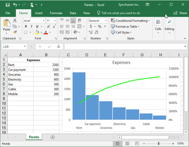
A Pareto chart is a sorted histogram where columns are sorted in descending order and a line representing the cumulative total percentage is plotted over top.
A complete sample that creates a Pareto chart can be downloaded here.
The example shows personal expenses in a sorted format. The line graph shows how each column or issue contributes to the overall total expenses. Notice from the bar graph that the rent category at 2300 was the highest expense. From the green line graph, we see that rent contributed to 40% of all other expenses.
The following code example illustrates how to create a Pareto chart in C# using XlsIO.
using (ExcelEngine excelEngine = new ExcelEngine())
{
IApplication application = excelEngine.Excel;
application.DefaultVersion = ExcelVersion.Excel2016;
IWorkbook workbook = application.Workbooks.Open(“Sample.xlsx”, ExcelOpenType.Automatic);
IWorksheet sheet = workbook.Worksheets[0];
IChartShape chart = sheet.Charts.Add();
//Set chart type as Pareto
chart.ChartType = ExcelChartType.Pareto;
//Set data range in the worksheet
chart.DataRange = sheet[“A2:B8”];
//Set category values as bin values
chart.PrimaryCategoryAxis.IsBinningByCategory = true;
//Formatting Pareto line
chart.Series[0].ParetoLineFormat.LineProperties.ColorIndex = ExcelKnownColors.Bright_green;
//Gap width settings
chart.Series[0].SerieFormat.CommonSerieOptions.GapWidth = 6;
//Set the chart title
chart.ChartTitle = “Expenses”;
//Hiding the legend
chart.HasLegend = false;
workbook.SaveAs(“Pareto.xlsx”);
}
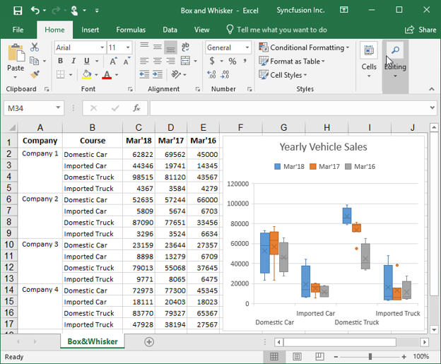
Box and whisker chart
A box and whisker chart shows a distribution of data into quartiles, highlighting the mean and outliers. One use case is to easily identify the minimum and maximum difference in data for a specific product from different companies. Box and whisker charts are most commonly used in statistical analysis.
A complete sample that creates a box and whisker chart can be downloaded here.
The example shows the yearly sales of different vehicle types from four different companies. This type of chart visualizes which vehicle type is leading in sales.
The following code example illustrates how to create a box and whisker chart in C# using XlsIO.
using (ExcelEngine excelEngine = new ExcelEngine())
{
IApplication application = excelEngine.Excel;
application.DefaultVersion = ExcelVersion.Excel2016;
IWorkbook workbook = application.Workbooks.Open(“Sample.xlsx”, ExcelOpenType.Automatic);
IWorksheet sheet = workbook.Worksheets[0];
IChartShape chart = sheet.Charts.Add();
//Set the chart title
chart.ChartTitle = “Yearly Vehicle Sales”;
//Set chart type as box and whisker
chart.ChartType = ExcelChartType.BoxAndWhisker;
//Set data range in the worksheet
chart.DataRange = sheet[“A1:E17”];
//Box and whisker settings on first series
IChartSerie seriesA = chart.Series[0];
seriesA.SerieFormat.ShowInnerPoints = false;
seriesA.SerieFormat.ShowOutlierPoints = true;
seriesA.SerieFormat.ShowMeanMarkers = true;
seriesA.SerieFormat.ShowMeanLine = false;
seriesA.SerieFormat.QuartileCalculationType = ExcelQuartileCalculation.ExclusiveMedian;
//Box and whisker settings on second series
IChartSerie seriesB = chart.Series[1];
seriesB.SerieFormat.ShowInnerPoints = false;
seriesB.SerieFormat.ShowOutlierPoints = true;
seriesB.SerieFormat.ShowMeanMarkers = true;
seriesB.SerieFormat.ShowMeanLine = false;
seriesB.SerieFormat.QuartileCalculationType = ExcelQuartileCalculation.InclusiveMedian;
//Box and whisker settings on third series
IChartSerie seriesC = chart.Series[2];
seriesC.SerieFormat.ShowInnerPoints = false;
seriesC.SerieFormat.ShowOutlierPoints = true;
seriesC.SerieFormat.ShowMeanMarkers = true;
seriesC.SerieFormat.ShowMeanLine = false;
seriesC.SerieFormat.QuartileCalculationType = ExcelQuartileCalculation.ExclusiveMedian;
workbook.SaveAs(“Box and Whisker.xlsx”);
}
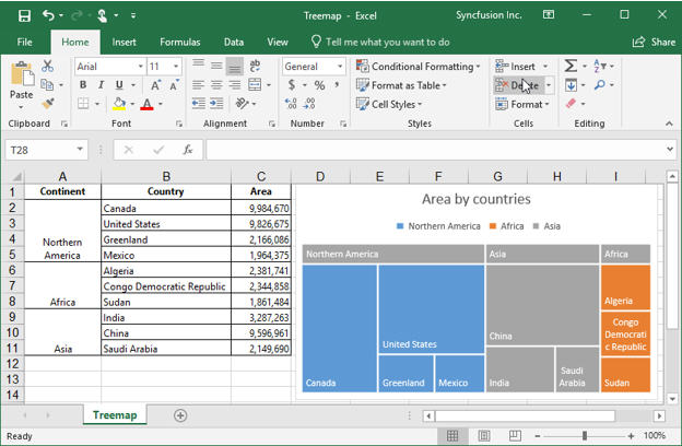
Tree map chart
A tree map chart provides a hierarchical view of data and makes it easy to spot patterns. The tree branches are represented by rectangles and each sub-branch is shown as a smaller rectangle. Here, the chart displays categories by color and proximity and can easily show lots of data that would be difficult to visualize with other chart types.
A complete sample that creates a tree map chart can be downloaded here.
The example charts the areas of different countries. This chart can be used to find the best item across various categories.
The following code example illustrates how to create a tree map chart in C# using XlsIO.
using (ExcelEngine excelEngine = new ExcelEngine())
{
IApplication application = excelEngine.Excel;
application.DefaultVersion = ExcelVersion.Excel2016;
IWorkbook workbook = application.Workbooks.Open(“Sample.xlsx”, ExcelOpenType.Automatic);
IWorksheet sheet = workbook.Worksheets[0];
IChartShape chart = sheet.Charts.Add();
//Set chart type as tree map
chart.ChartType = ExcelChartType.TreeMap;
//Set data range in the worksheet
chart.DataRange = sheet[“A2:C11”];
//Set the chart title
chart.ChartTitle = “Area by countries”;
//Set the tree map label option
chart.Series[0].SerieFormat.TreeMapLabelOption = ExcelTreeMapLabelOption.Banner;
//Formatting data labels
chart.Series[0].DataPoints.DefaultDataPoint.DataLabels.Size = 8;
workbook.SaveAs(“Treemap.xlsx”);
}
Sunburst chart
A sunburst chart provides a hierarchical view of data where each level of the hierarchy is represented by one ring or circle, with the innermost circle as the top of the hierarchy.
A complete sample that creates a sunburst chart can be downloaded here.
The sample uses the sunburst chart to look at a company’s quarterly sales for the year in detail. The data table drills down to a few category levels: quarter, month, and week. When we want to view sales values for specific weeks, the sunburst chart will give us a final outer circle that identifies the weeks for a specific month of a quarter.
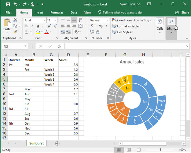
Note the size and relationship of the week boxes to their parent month box and quarter box. Each week contributed a portion of the monthly sales, which in turn contributed to the quarterly sales. The sunburst chart accurately represents these contributions.
The following code example illustrates how to create a sunburst chart in C# using XlsIO.using (ExcelEngine excelEngine = new ExcelEngine())
{
IApplication application = excelEngine.Excel;
application.DefaultVersion = ExcelVersion.Excel2016;
IWorkbook workbook = application.Workbooks.Open(“Sample.xlsx”, ExcelOpenType.Automatic);
IWorksheet sheet = workbook.Worksheets[0];
IChartShape chart = sheet.Charts.Add();
//Set chart type as sunburst
chart.ChartType = ExcelChartType.SunBurst;
//Set data range in the worksheet
chart.DataRange = sheet[“A1:D16”];
//Set the chart title
chart.ChartTitle = “Sales by annual”;
//Formatting data labels
chart.Series[0].DataPoints.DefaultDataPoint.DataLabels.Size = 8;
//Hiding the legend
chart.HasLegend = false;
workbook.SaveAs(“Sunburst.xlsx”);
}
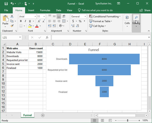
Funnel chart
Funnel charts show values across multiple stages in a process.
A complete sample that creates a funnel chart can be downloaded here.
The example shows the number of sales prospects at each stage in a sales pipeline. Typically, the values decrease gradually, allowing the bars to resemble a funnel.
The following code example illustrates how to create a funnel chart in C# using XlsIO.
using (ExcelEngine excelEngine = new ExcelEngine())
{
IApplication application = excelEngine.Excel;
application.DefaultVersion = ExcelVersion.Excel2016;
IWorkbook workbook = application.Workbooks.Open(“Sample.xlsx”, ExcelOpenType.Automatic);
IWorksheet sheet = workbook.Worksheets[0];
IChartShape chart = sheet.Charts.Add();
//Set chart type as funnel
chart.ChartType = ExcelChartType.Funnel;
//Set data range in the worksheet
chart.DataRange = sheet.Range[“A1:B6”];
//Set the chart title
chart.ChartTitle = “Funnel”;
//Formatting the legend and data label option
chart.HasLegend = false;
chart.Series[0].DataPoints.DefaultDataPoint.DataLabels.IsValue = true;
chart.Series[0].DataPoints.DefaultDataPoint.DataLabels.Size = 8;
workbook.SaveAs(“Funnel.xlsx”);
}
Note: This chart is only available if you have an Office 365 subscription.
Conclusion
These new chart types provide a rich set of storytelling tools in Excel that enable you to do more with your data. These charts can be created in just a few lines of code using the Syncfusion Essential XlsIO library. To make them more appealing, various formatting can be done to customize the axis labels, legends, data labels, title, series, and other chart elements.
Using Essential XlsIO, you can also create and edit other chart types such as column, line, pie, doughnut, bar, area, scatter, bubble, stock, surface, radar, combination, and more.
If you are new to our XlsIO library, it is highly recommended that you follow our Getting Started guide.
If you’re already a Syncfusion user, you can download the product setup here. If you’re not yet a Syncfusion user, you can download a free, 30-day trial here.
If you have any questions or would like clarifications about this support, please let us know in the comments below. You can also contact us through our support forum or Direct-Trac. We are happy to assist you!


Comments (2)
Thank you for this great post!
Can you give me a hint, how to change the label color of a waterfall-datapoint?
I need to set the last label to color to white.
Thank you,
Stefan
Thank you for the comment.
Support to modify data point labels of Excel 2016 charts is currently not available. This feature will be implemented in our upcoming volume release (17.2), expected to be rolled out in June 2019.
Comments are closed.