
In data visualization, charts play a vital role in representing data. If you’re looking for stunning charts for the Angular framework, the Essential JS 2 chart component provides them with a variety of impressive features.
In this blog, we are going to walk through the process of creating a simple chart in an Angular application and configuring the basic features. The complete code can be found at our GitHub repository.
Setting up the development environment
You should set up a development environment before creating a chart in Angular. Since the source is available in GitHub and packages are available in npm, you can get started with a chart in a few easy steps.
Creating an Angular application
To create an Angular application, install the Angular CLI globally using the following command.
npm install -g @angular-cli
Then create a new Angular application using the following command.
ng new my-app
This command downloads all the files needed and initializes the npm installation.
Installing the chart component
After the Angular application has been created, use the following command to install the chart package.
cd my-app
npm install @syncfusion/ej2-ng-charts –save
The –save flag saves the charts package as a dependency in the package.json file.
Configuring the chart
All configuration related to environment setup is now complete. Before configuring the chart, a component is needed to render the chart. To create an Angular component, use the following Angular CLI command.
ng generate component chartNext, import the chart module in the app.module.ts file.
import { BrowserModule } from '@angular/platform-browser';
import { NgModule } from '@angular/core';
import { AppComponent } from './app.component';
import { ChartComponent } from './chart/chart.component';
import { ChartModule } from '@syncfusion/ej2-ng-charts’;

@NgModule ({
 declarations: [AppComponent,ChartComponent],
 imports: [BrowserModule, ChartModule],
 bootstrap: [AppComponent]
})
export class AppModule { }
Creating the chart component
All configuration related to the chart is now complete. Now we need to define our first chart in the chart.component.html file.
<ejs-chart></ejs-chart>
Then, add the chart component in the app.component.html file.
<app-chart></app-chart>
Serving the application
Go to the application directory and launch the server by using the following command.
ng serve -open
After all the files are compiled successfully, the basic chart should look like the following figure.
Injecting modules
Now we have the basic chart without data. Before providing some data to it, let’s learn more about the chart types that Syncfusion supports.
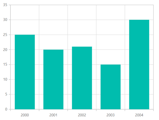
The Syncfusion chart component can plot more than 25 chart types. Each type is modularized and available as a separate service, so you can use only the modules you need, to keep your app lightweight. For example, if you want to visualize data with a column chart, define the columnSeriesService in the providers of the app.module.ts file. This service provides access to the column chart functionality.
import { ChartModule } from '@syncfusion/ej2-ng-charts';
import { CategoryService, ColumnSeriesService } from '@syncfusion/ej2-ng-charts';

@NgModule({
  imports: [ BrowserModule, ChartModule ],
  providers: [CategoryService, ColumnSeriesService ]
 })
After the columnSeriesService is injected in the providers, set the series type as Column and populate the data in the chart by using the dataSource property, which accepts a JavaScript object.
import {Component, OnInit } from '@angular/core';
@Component({
    selector: 'app-chart',
    template:`<ejs-chart id="chart-container" [primaryXAxis]="primaryXAxis">
              <e-series-collection>
              <e-series [dataSource]="chartData" type="Column" xName="year" yName="gold"
              name="Gold">
              </e-series>
              </e-series-collection>
              </ejs-chart>`
})

export class AppComponent implements OnInit {
    public chartData: Object [];
    public primaryXAxis: Object;
    ngOnInit(): void {
        // Data for chart series
        this.chartData = [
            { year:'2000', gold: 35, silver: 25 }, { year: '2001', gold: 28, silver: 20 },
            { year:'2002', gold: 34, silver: 21 }, { year: '2003', gold: 32, silver: 15 },
            { year:'2004', gold: 40, silver: 30 }
         ];
         this.primaryXAxis = { valueType: 'Category' };
    }

}
Building other chart types
Implementing other Cartesian chart types is very similar to implementing the column chart. If you want an area or line chart, just inject its corresponding services into the providers and change the series type.
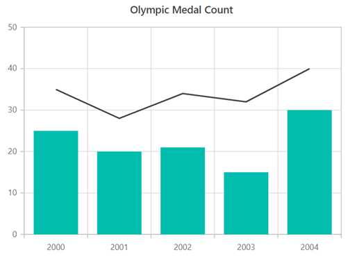
Let’s visualize some other set of data with a line chart type by adding another series to our column chart.
import { ChartModule } from '@syncfusion/ej2-ng-charts';
import { CategoryService, ColumnSeriesService, LineSeriesService} from '@syncfusion/ej2-ng-charts';

@NgModule({
imports: [ BrowserModule, ChartModule ],
providers: [CategoryService, ColumnSeriesService, LineSeriesService]
})
  `<ejs-chart id="chart-container" [primaryXAxis]="primaryXAxis">

   <e-series [dataSource]="chartData" type="Column" xName="year" yName="gold" name="Gold">
   <e-series [dataSource]="chartData" type="Line" xName="year" yName="silver" name="Silver">

    </ejs-chart>`
Title
A chart can be given a title to inform users what to look for in the graph. The text of the title can be customized using the title property.
`<ejs-chart id="chart-container" [primaryXAxis]="primaryXAxis" [title]="title">

        <e-series [dataSource]="chartData" type="Column" legendShape="Circle" xName="year" yName="gold" name="Gold">
        <e-series [dataSource]="chartData" type="Line" legendShape="Triangle" xName="year" yName="silver" name="Silver">

  </ejs-chart>`

export class AppComponent implements OnInit {
    public title: Object;
    public primaryXAxis: Object;
    ngOnInit(): void {
        this.primaryXAxis = { valueType: 'Category'  };
        this.title = 'Olympic Medal Count';
    }
}
Legend
Another way end users can interact with the chart component is through a legend. You can access the legend functionality by injecting the LegendService in the providers. Also, you should set the visible property in the legendSettings to true.
Each series type has its own legend icon that will be displayed in the legend, and the name specified for the series will be displayed next to it. In the following code example, we are going to change the legend icons to rectangle and circle through the legendShape property in the series.
import { ChartModule } from '@syncfusion/ej2-ng-charts';
import { CategoryService, ColumnSeriesService, LineSeriesService, LegendService } from '@syncfusion/ej2-ng-charts';
@NgModule({
    imports: [ BrowserModule, ChartModule ],
    providers: [CategoryService, ColumnSeriesService, LineSeriesService, LegendService]
   })
   <ejs-chart id="chart-container" [primaryXAxis]="primaryXAxis" [legendSettings]="legendSettings">

       <e-series [dataSource]="chartData" type="Column" legendShape="Rectangle" xName="year" yName="gold" name="Gold">
       <e-series [dataSource]="chartData" type="Line" legendShape="Circle" xName="year" yName="silver" name="Silver">

    </ejs-chart>`

   export class AppComponent implements OnInit {
      public title: Object;
      public primaryXAxis: Object;
      public legendSettings: Object;
      ngOnInit(): void {
         this.primaryXAxis = { valueType: 'Category' };
         this.legendSettings = {visible : true};
    }
  }
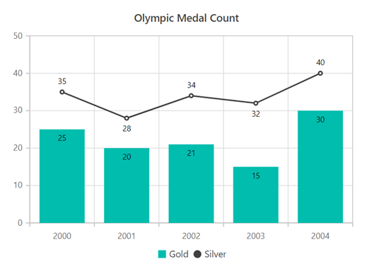
After enabling the legend, the chart will appear as shown in the following figure. You can now interact with the legend to collapse or select the series you want.

Data labels
Data labels are designed for situations where you want to improve the readability of your data. You can access the data label functionality by injecting the DataLabelService in the providers and enabling the visible property in the data labels.
The position of data labels can also be changed so that they are placed smartly. In the following code example, we are moving the data label for a column chart inside the bar by using the position property.
import { ChartModule } from '@syncfusion/ej2-ng-charts';
import { CategoryService, ColumnSeriesService, LineSeriesService, LegendService, DataLabelService  } from '@syncfusion/ej2-ng-charts';

@NgModule({
imports: [ BrowserModule, ChartModule ],
providers: [CategoryService, ColumnSeriesService, LineSeriesService, LegendService, DataLabelService ]
 })
`<ejs-chart id="chart-container" [primaryXAxis]="primaryXAxis" [legendSettings]="legendSettings">

      <e-series [dataSource]="chartData" type="Column" legendShape="Circle" xName="year" yName="gold" name="Gold" [marker]="columnMarker">
      <e-series [dataSource]="chartData" type="Line" legendShape="Triangle" xName="year" yName="silver" name="Silver" [marker]="lineMarker">

    </ejs-chart>`

   export class AppComponent implements OnInit {
    public title: Object;
    public primaryXAxis: Object;
    public legendSettings: Object;
    public lineMarker : Object;
    public columnMarker : Object;
    ngOnInit(): void {
        this.primaryXAxis = { valueType: 'Category' };
        this.legendSettings = {visible : true};
        this.columnMarker = { dataLabel : { visible :true, position: 'Top'}};
        this.lineMarker = { visible : true, dataLabel : { visible :true }};
    }
}
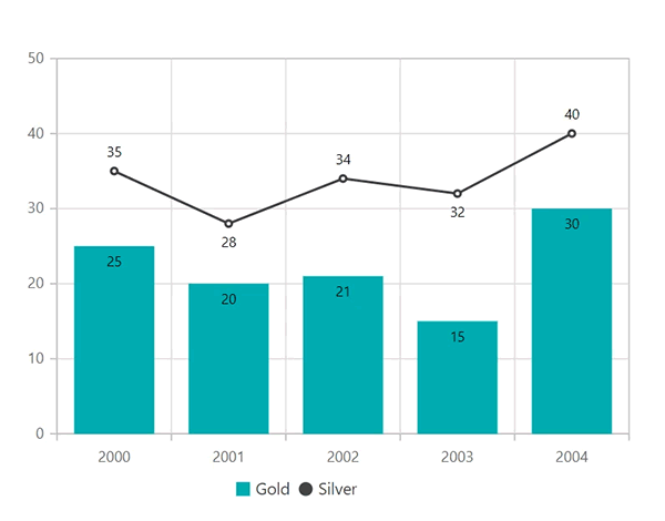
After enabling data labels, our chart will appear as follows.
Tooltips
Using tooltip, you can also provide more information about chart data points when pointing to them. To make use of the tooltip functionality, just inject the TooltipService in the provider and enable the tooltip by setting the enable property to true
import { ChartModule } from '@syncfusion/ej2-ng-charts';
import { CategoryService, ColumnSeriesService, LineSeriesService, DataLabelService, LegendService, TooltipService  } from '@syncfusion/ej2-ng-charts';
@NgModule({
imports: [ BrowserModule, ChartModule ],
providers: [CategoryService, ColumnSeriesService, LineSeriesService, DataLabelService, LegendService, TooltipService ]
 })
`<ejs-chart id="chart-container" [primaryXAxis]="primaryXAxis" [legendSettings]="legendSettings" [tooltip]="tooltip">

     <e-series [dataSource]="chartData" type="Column" legendShape="Circle" xName="year" yName="gold" name="Gold" [marker]="columnMarker">
     <e-series [dataSource]="chartData" type="Line" legendShape="Triangle" xName="year" yName="silver" name="Silver" [marker]="lineMarker">

 </ejs-chart>`

export class AppComponent implements OnInit {
    public title: Object;
    public primaryXAxis: Object;
    public legendSettings: Object;
    public lineMarker : Object;
    public columnMarker : Object;
    public tooltip : Object;
    ngOnInit(): void {
        this.primaryXAxis = { valueType: 'Category'  };
        this.legendSettings = {visible : true};
        this.columnMarker = { dataLabel : { visible :true, position: 'Top'}};
        this.lineMarker = { dataLabel : { visible :true }};
        this.tooltip = {enable : true};
    }
}

Conclusion
In this blog, we learned how to create a simple chart and enhance its basic features. The chart component offers many other advanced features, such as data binding with different adaptors, zooming, selection, trackball, crosshair, financial charts, polar and radar charts, pie charts, annotations, axis types, strip lines, and much more.
We recommend checking out the chart component on your own through the source on GitHub, the interactive sample browser, and the documentation to explore all of its features and API. Also, be sure to check out the chart sample on GitHub, which is readily runnable, to see just how easy it is to create and configure charts.
Hoping the chart is available for other frameworks. You’re in luck. It’s currently available for ASP.NET Core, ASP.NET MVC, JavaScript, and React, and will soon be available for Vue as well (except in the 2018 Volume 2 release).
If you have any questions or comments, please let us know in the comments below. You can also contact us through our support forum, support portal, or feedback portal. We are happy to assist you!