Welcome to our Chart of the Week blog series!
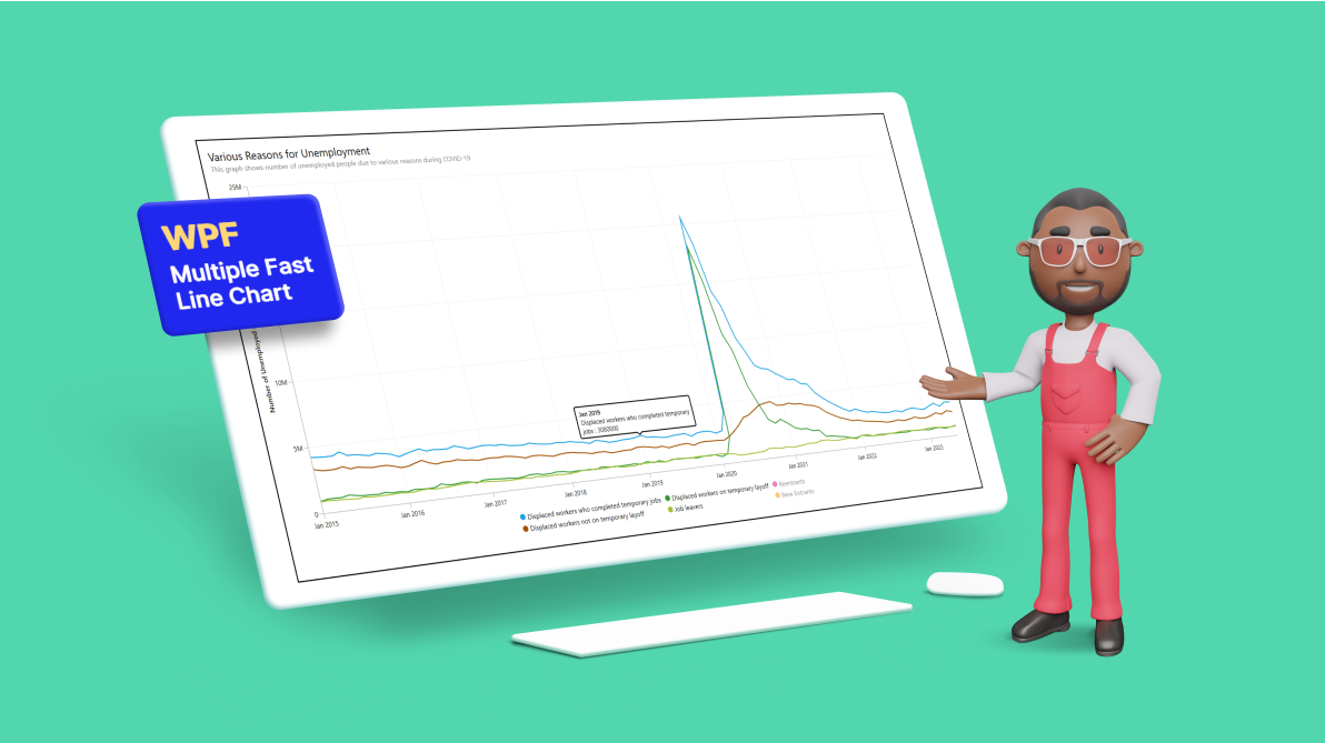
In today’s blog, we’ll use the Syncfusion WPF Fast Line Chart to create a multiple-line chart that displays the impact of COVID-19 on unemployment rates for different reasons. Please note that this control is only supported on Windows desktops.
The U.S. Bureau of Labor Statistics describes the Current Population Survey (CPS) as “a monthly survey of households conducted by the Bureau of Census for the Bureau of Labor Statistics.” According to its site, the survey offers a “comprehensive body of data on the labor force, employment, unemployment, persons not in the labor force, hours of work, earnings, and other labor force characteristics.
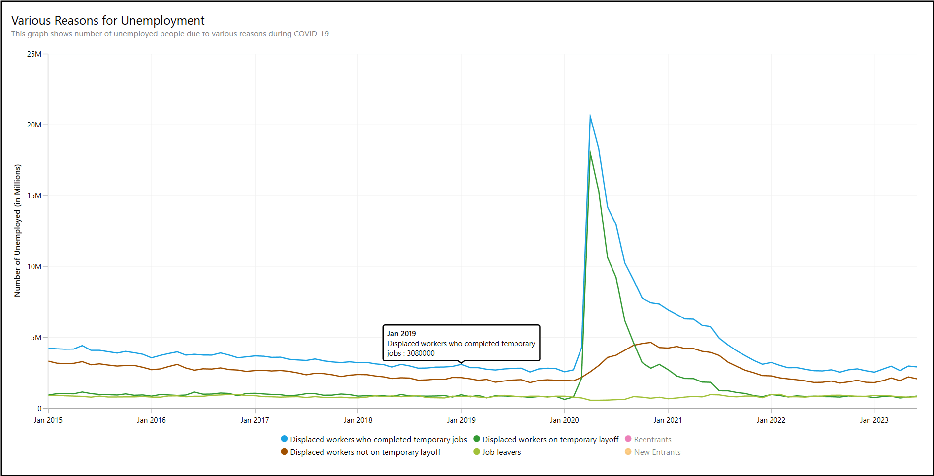
To assess the key indicators and the reasons for unemployment during COVID-19, the data on unemployed people has been visualized in a graph.
Let’s see how to create a multiple-line chart using the Syncfusion WPF Fast Line Chart control to visualize COVID-19 economic trends. We have chosen the fast line chart because it displays a considerable volume of data in a few seconds and provides smooth interactions.
Step 1: Gathering the data on unemployment
Before creating the chart, we gather data on unemployment from the U.S. Bureau of Labor Statistics. As I said previously, we obtain data on COVID-19 Economic Trends and choose the chart Reasons for unemployment. You can export the CSV file from the bottom of the chart page using the Show Table button.
Step 2: Preparing the data for the WPF multiple Fast Line Chart
We need to convert the CSV data into a collection to create a multiple fast line series chart in WPF.
To do so, let’s define the JoblessCategory model class to hold monthly data on the unemployment causes (completed temporary jobs, not on temporary layoffs, job leavers, reentrants, and new entrants) using the appropriate property names.
Refer to the following code example.
public class JoblessCategory
{
    public DateTime Month { get; set; }
    public double CompletedTempJobs { get; set; }
    public double NotOnTempLayoff { get; set; }
    public double OnTemporaryLayoff { get; set; }
    public double JobLeavers { get; set; }
    public double Reentrants { get; set; }
    public double NewEntrants { get; set; }

    public JoblessCategory(DateTime month, double jobless1, double jobless2, double jobless3, double
                                               jobless4, double jobless5, double jobless6)
    {
        Month = month;
        CompletedTempJobs = jobless1;
        NotOnTempLayoff = jobless2;
        OnTemporaryLayoff = jobless3;
        JobLeavers = jobless4;
        Reentrants = jobless5;
        NewEntrants = jobless6;
    }
}
To generate an ObservableCollection of the JoblessCategory model type and its properties, we need to load the CSV data into the WPF chart. To do so, read the CSV data path file using the ReadCSV method in the ViewModel class. Then, convert each set of data to a collection of strings; split each line of string at a specific, comma-separated place; and store it in the Model class objects. Add them to the collection and return it.
Finally, call the ReadCSV method to set the collection to the UnemploymentData collection in the ViewModel class.
public class ViewModel
 {
     private List<JoblessCategory> unemployedData = new List<JoblessCategory>();
     private JoblessCategory? model;

     public List<JoblessCategory> UnemploymentData { get; set; }
     public ViewModel()
     {
         UnemploymentData = new List<JoblessCategory>(ReadCSV("COVID19_MultiLine_Chart.bls_table.csv"));
     }

     public IEnumerable<JoblessCategory> ReadCSV(string fileName)
     {
         Assembly executingAssembly = typeof(App).GetTypeInfo().Assembly;
         Stream inputStream = executingAssembly.GetManifestResourceStream(fileName);
         if (inputStream != null)
         {

             string line;
             List<string> lines = new List<string>();
             StreamReader reader = new StreamReader(inputStream);
             while ((line = reader.ReadLine()) != null)
             {
                 lines.Add(line);
             }

             lines.RemoveAt(0);

             for (int i = 0; i < lines.Count; i++)
             {
                 string input = lines[i];
                 if (input.EndsWith(","))
                     input = input.TrimEnd(',');

                 // Split by comma, excluding the ones inside quotes
                 string[] data = input.Split(new[] { "\",\"" }, StringSplitOptions.None);

                 // Remove leading and trailing quotes from each part
                 for (int j = 0; j < data.Length; j++)
                 {
                     data[j] = data[j].Trim('\"');
                 }

                 DateTime resultDate = DateTime.ParseExact(data[0], "MMM yyyy", CultureInfo.InvariantCulture);
                 model = new JoblessCategory(resultDate, Convert.ToDouble(data[1]), Convert.ToDouble(data[2]), Convert.ToDouble(data[3]), Convert.ToDouble(data[4]), Convert.ToDouble(data[5]), Convert.ToDouble(data[6]));
                 unemployedData.Add(model);
             }
         }

         return unemployedData;
     }
 }
Step 3: Configuring the WPF multiple Fast Line Chart
Let’s configure the Syncfusion WPF Charts control using this documentation.
Here, we’ll use the Syncfusion FastLineSeries instance to visualize the differences among the various reasons for unemployment during the COVID-19 pandemic.
Refer to the following code example.
<sync:FastLineSeries ItemsSource="{Binding UnemploymentData}" XBindingPath="Month" YBindingPath="CompletedTempJobs" Label="Displaced workers who completed temporary jobs" ShowTooltip="True" . . . >
</sync:FastLineSeries>

<sync:FastLineSeries ItemsSource="{Binding UnemploymentData}" XBindingPath="Month" YBindingPath="NotOnTempLayoff" Label="Displaced workers not on temporary layoff" ShowTooltip="True" . . . >
</sync:FastLineSeries>

<sync:FastLineSeries ItemsSource="{Binding UnemploymentData}" XBindingPath="Month" YBindingPath="OnTemporaryLayoff" Label="Displaced workers on temporary layoff" ShowTooltip="True" . . . >
</sync:FastLineSeries>

<sync:FastLineSeries ItemsSource="{Binding UnemploymentData}" XBindingPath="Month" YBindingPath="JobLeavers" Label="Job leavers" ShowTooltip="True" . . . >
</sync:FastLineSeries>

<sync:FastLineSeries ItemsSource="{Binding UnemploymentData}" XBindingPath="Month" YBindingPath="Reentrants"  Label="Reentrants" ShowTooltip="True" IsSeriesVisible="False" . . . >
</sync:FastLineSeries>

<sync:FastLineSeries ItemsSource="{Binding UnemploymentData}" XBindingPath="Month" YBindingPath="NewEntrants" Label="New Entrants" ShowTooltip="True" IsSeriesVisible="False" . . . >
</sync:FastLineSeries>
In the previous code example, we’ve bound the ItemsSource property to the UnemploymentData objects containing properties of various unemployment reasons as double objects. We specified each Month as XBindingPath and unemployment reasons as properties to each series YBindingPath. This will tell the chart which data points to utilize for the x- and y-axes.
Step 4: Customizing the chart appearance
We can also customize the appearance of the chart by adding a custom tooltip, titles, and a legend.
Customizing the chart title
Refer to the following code example to customize the chart’s title using the Header property and set its position using the HorizontalHeaderAlignment property.
<sync:SfChart HorizontalHeaderAlignment="Left">
   . . .
  <sync:SfChart.Header>
   <StackPanel Margin="0,0,0,20">
    <TextBlock Text="Various Reasons for Unemployment" FontSize="20"/>
    <TextBlock Text="This graph shows number of unemployed people due to various reasons during COVID-19"  FontSize="13" Foreground="Gray"/>
   </StackPanel>
  </sync:SfChart.Header>
   . . .
</sync:SfChart>
Customizing the chart axes
Let’s customize the DateTimeAxis elements using the IntervalType and LabelFormat properties and the NumericalAxis using the Header, LabelExtent, and Interval properties and the LabelCreated event.
<sync:SfChart.PrimaryAxis>
 <sync:DateTimeAxis IntervalType="Years" LabelFormat="MMM yyyy">
 </sync:DateTimeAxis>
</sync:SfChart.PrimaryAxis>

<sync:SfChart.SecondaryAxis>
 <sync:NumericalAxis Header="Number of Unemployed" LabelExtent="25"
                     Interval="5000000" LabelCreated="NumericalAxis_LabelCreated">
 </sync:NumericalAxis>
</sync:SfChart.SecondaryAxis>
Refer to the following code example to format the numerical axis labels using the LabelCreated event.
private void NumericalAxis_LabelCreated(object sender, LabelCreatedEventArgs e)
{
    if(e.AxisLabel is ChartAxisLabel label && label.LabelContent is string content && content != "0")
    {
        var value = double.Parse(content) / 1000000;
        label.LabelContent = value.ToString()+"M";
    }
}
Customizing the chart tooltips
We can customize the background of the chart tooltip using the Style property of the ChartTooltipBehavior. Create a style of target type Path as a resource and define the desired background. Then, set the style key to the Style property, as shown in the following code example.
<ResourceDictionary>
 <Style TargetType="Path" x:Key="tooltipStyle">
  <Setter Property="Stroke" Value="Black"/>
  <Setter Property="Fill" Value="White"/>
  <Setter Property="StrokeThickness" Value="2"/>
 </Style>
</ResourceDictionary>

<sync:SfChart.Behaviors>
 <sync:ChartTooltipBehavior Style="{StaticResource tooltipStyle}" ShowDuration="5000" />
</sync:SfChart.Behaviors>
We can also design a custom tooltip using the TooltipTemplate property. For this, create a data template to display the month and unemployment rate values. Create a separate tooltip template for each series. We need to set a specific template key for each series, as shown in the following code example.
<ResourceDictionary>
 <DataTemplate x:Key="tooltipTemplate1">
  <StackPanel Orientation="Vertical">
   <TextBlock Text="{Binding Item.Year, StringFormat='MMM yyyy'}" Foreground="Black"
              FontSize="12" FontWeight="Medium"/>
    <StackPanel Orientation="Vertical">
     <TextBlock Text="Displaced workers who completed temporary" Foreground="Black" FontSize="12"/>
     <StackPanel Orientation="Horizontal">
      <TextBlock Text="jobs : " Foreground="Black" FontSize="12"/>
      <TextBlock Text="{Binding Item.CompletedTempJobs}" Foreground="Black" FontSize="12"/>
     </StackPanel>
    </StackPanel>
  </StackPanel>
 </DataTemplate>
 <DataTemplate x:Key="tooltipTemplate2">
        . . .
 </DataTemplate>
 <DataTemplate x:Key="tooltipTemplate3">
        . . .
 </DataTemplate>
 <DataTemplate x:Key="tooltipTemplate4">
        . . .
 </DataTemplate>
 <DataTemplate x:Key="tooltipTemplate5">
        . . .
 </DataTemplate>
 <DataTemplate x:Key="tooltipTemplate6">
        . . .
 </DataTemplate>
</ResourceDictionary>

<sync:FastLineSeries ItemsSource="{Binding UnemploymentData}" ShowTooltip="True" TooltipTemplate="{StaticResource tooltipTemplate1}". . . >
</sync:FastLineSeries>
<sync:FastLineSeries ItemsSource="{Binding UnemploymentData}" ShowTooltip="True" TooltipTemplate="{StaticResource tooltipTemplate2}" . . . >
</sync:FastLineSeries>
<sync:FastLineSeries ItemsSource="{Binding UnemploymentData}" ShowTooltip="True" TooltipTemplate="{StaticResource tooltipTemplate3}" . . . >
</sync:FastLineSeries>
<sync:FastLineSeries ItemsSource="{Binding UnemploymentData}" ShowTooltip="True" TooltipTemplate="{StaticResource tooltipTemplate4}" . . . >
</sync:FastLineSeries>
<sync:FastLineSeries ItemsSource="{Binding UnemploymentData}" ShowTooltip="True" IsSeriesVisible="False" TooltipTemplate="{StaticResource tooltipTemplate5}" . . . >
</sync:FastLineSeries>
<sync:FastLineSeries ItemsSource="{Binding UnemploymentData}" ShowTooltip="True" IsSeriesVisible="False" TooltipTemplate="{StaticResource tooltipTemplate6}" . . . >
</sync:FastLineSeries>
Customizing the chart legend
To customize and wrap the ChartLegend items, create an ItemsPanelTemplate as a WrapPanel with vertical orientation and set a specific height to split items evenly in rows and columns. Then, set the key value to the legend ItemsPanel property.
Additionally, enable the ToggleSeriesVisibility support in the legend to filter the unemployment causes data of each series.
<sync:SfChart.Resources>
 <ItemsPanelTemplate x:Key="itemPanelTemplate">
  <WrapPanel Orientation="Vertical" Height="50"/>
 </ItemsPanelTemplate>
</sync:SfChart.Resources>

<sync:SfChart.Legend>
 <sync:ChartLegend DockPosition="Bottom" ToggleSeriesVisibility="True"
                   ItemsPanel="{StaticResource itemPanelTemplate}"
                   IconHeight="11" IconWidth="11" FontSize="13"/>
</sync:SfChart.Legend>
To hide certain series, set the IsSeriesVisible property value to false for that series. However, when toggling the legend icon, those hidden series will become visible again. In the following code, I’ve also changed the legend icon’s shape to a circle using the LegendIcon property.
<sync:FastLineSeries ItemsSource="{Binding UnemploymentData}" XBindingPath="Year"
      YBindingPath="NewEntrants" IsSeriesVisible="False" LegendIcon="Circle" . . . >
</sync:FastLineSeries>
   . . .
//Similar for all other series. . .
Highlighting the chart series based on interaction
A series will be highlighted when the tooltip is invoked on it. To achieve this, we use the MouseEnter event in each series. When the pointer hovers over a series in the chart, the MouseEnter event of the series will be called. Then, the StrokeThickness of the mouse interacting series will increase, and the stroke thickness for the remaining series will be set to the default value.
When the pointer moves out of the chart area, the MouseLeave event will be called, resetting the StrokeThickness to default in all the series, as demonstrated in the following code example.
XML
<sync:SfChart x:Name="chart" HorizontalHeaderAlignment="Left" MouseLeave="FastLineSeries_MouseLeave">
    . . .
    //Chart header . . .
    . . .
    . . .
    //Chart axis and legend . . .
    . . .
    <sync:FastLineSeries ItemsSource="{Binding UnemploymentData}" XBindingPath="Year"
          YBindingPath="CompletedTempJobs" MouseEnter="SfChart_MouseEnter" . . . >
    </sync:FastLineSeries>
    . . .
    //Similar for all other series. . .
    . . .
</sync:SfChart>
C#
private void SfChart_MouseEnter(object sender, MouseEventArgs e)
{
    if (sender is ChartSeries series)
    {
        foreach(var chartSeries in chart.Series)
        {
            if(chartSeries != series)
            {
                chartSeries.StrokeThickness = 2;
            }
            else
            {
                series.StrokeThickness = 4;
            }
        }
    }
}

private void FastLineSeries_MouseLeave(object sender, MouseEventArgs e)
{
    foreach (var chartSeries in chart.Series)
    {
        chartSeries.StrokeThickness = 2;
    }
}
After executing these code examples, we will get the output as shown in the following image.
GitHub reference
For more details, refer to the demo on GitHub.
Conclusion
Thanks for reading! In this blog, we have seen how to visualize the COVID-19 pandemic’s impact on unemployment using the Syncfusion WPF multiple fast-line charts. Like this, you can also visualize other trends and changes over time. We encourage you to try the steps discussed and share your thoughts in the comments below.
If you require assistance, please don’t hesitate to contact us via our support forum, support portal, or feedback portal. We are always eager to help you!
Related blogs
- Visualize JSON Data Quickly Using WPF Charts
- Seamlessly Load Data from Different Data Sources into WPF Charts
- Chart of the Week: Visualize the Transfer Spending and Earning among the Football League Clubs Using WPF Scatter Chart
- Chart of the Week: Creating a WPF Range Column Chart to Visualize ChatGPT’s Performance in Competitive Exams