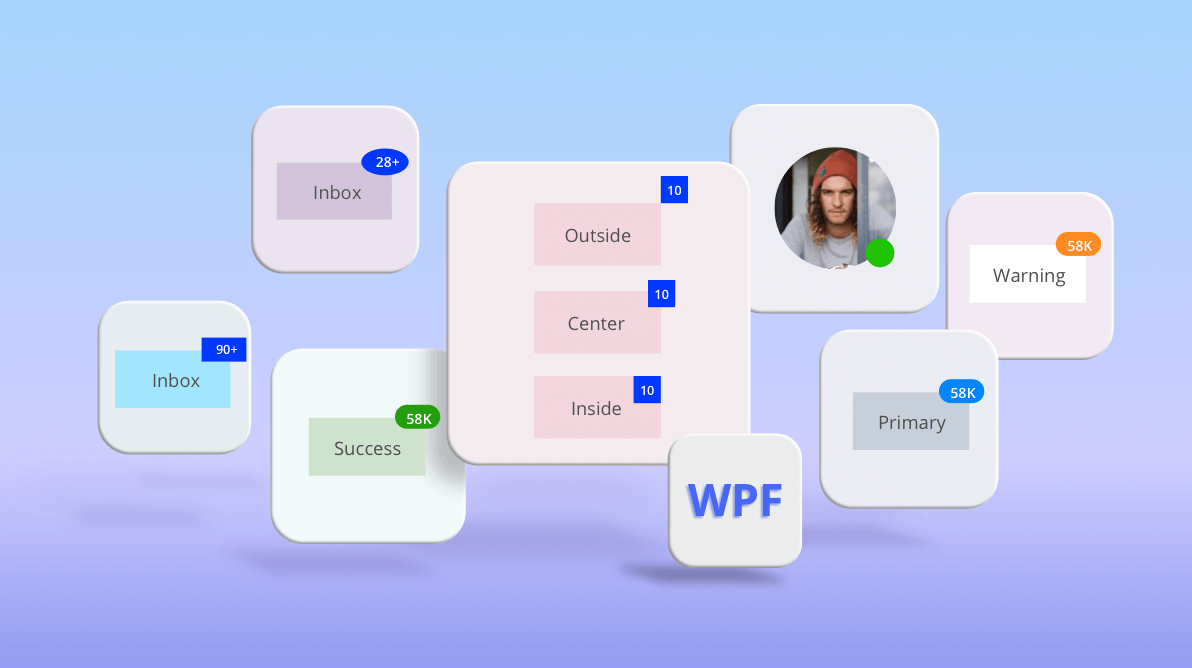
We are happy to announce the availability of the WPF Badge control in our 2020 Volume 4 release. This control comes in handy when you want to show notifications to your users. Depending on the content of the notifications, users may be prompted to perform some action. The following are some scenarios where badge notifications are useful:
- New messages in your inbox.
- A new version or update is available for your application.
- The availability of a person in a chat application.
- An error occurred during an upgrade process.
In this blog post, we will see how to add the Badge control to an application and discuss its customization options.
Attaching the Badge to an element
Let’s cover how to add the Badge control as a notification over a button.
- In Visual Studio, create a new WPF project.
- Add the Syncfusion.Tools.WPF NuGet package to the project reference.
- Import the Syncfusion WPF schema. As shown in the following code sample, we used syncfusion as a prefix to the namespace.
<Window xmlns="http://schemas.microsoft.com/winfx/2006/xaml/presentation" xmlns:x="http://schemas.microsoft.com/winfx/2006/xaml" xmlns:d="http://schemas.microsoft.com/expression/blend/2008" xmlns:mc="http://schemas.openxmlformats.org/markup-compatibility/2006" xmlns:syncfusion="http://schemas.syncfusion.com/wpf" </Window> - Add a button for which a notification is required.
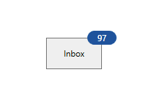
<Button HorizontalAlignment="Center" VerticalAlignment="Center" Content="Inbox" Width="70" Height="40"/> </Button> - Attach the Badge control to notify users of the unread count.
<Button Content="Inbox">
    <syncfusion:SfBadge.Badge>
        <syncfusion:SfBadge Content="10+" />
    </syncfusion:SfBadge.Badge>
</Button>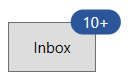

WPF Button with Badge Control
Badge alignment
The Badge control can be placed at any corner of the button by using the HorizontalAlignment and VerticalAlignment properties.
<Button Content="Mailbox">
    <syncfusion:SfBadge.Badge>
        <syncfusion:SfBadge Content="10"
                            HorizontalAlignment="Right"
                            VerticalAlignment="Bottom"/>
    </syncfusion:SfBadge.Badge>
</Button>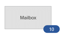
Badge anchor
The badge can be aligned within or outside the host control by using the HorizontalAnchor and VerticalAnchor properties.
<Button Content="Mailbox">
    <syncfusion:SfBadge.Badge>
        <syncfusion:SfBadge Content="10"
                            HorizontalAnchor="Outside"
                            VerticalAnchor="Outside"/>
    </syncfusion:SfBadge.Badge>
</Button>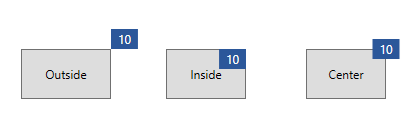
Badge precise alignment
You can fine-tune the alignment of the Badge control using the HorizontalPosition, VerticalPosition, HorizontalAnchorPosition, and VerticalAnchorPosition properties. These are relative APIs where 0 represents the top or leftmost position, and 1 represents the bottom or rightmost position. This means that when the size of the host control is changed, the position of the badge is relatively aligned. Refer to our documentation to learn more about custom alignment.
<Image
    Source="Assets/Badge/avatar.png">
    <syncfusion:SfBadge.Badge>
        <syncfusion:SfBadge
            HorizontalAnchor="Custom"
            VerticalAnchor="Custom"
            HorizontalPosition="0.8"
            VerticalPosition="0.8"
            HorizontalAnchorPosition="0.5"
            VerticalAnchorPosition="0.5">
            <Ellipse
                Width="20"
                Height="20"
                Fill="LimeGreen"/>
        </syncfusion:SfBadge>
    </syncfusion:SfBadge.Badge>
</Image>
Badge shape
The Badge control comes with a predefined set of standard shapes. However, you can customize the shape of the badge by using the CustomShape property.
<Button Content="Inbox">
    <syncfusion:SfBadge.Badge>
        <syncfusion:SfBadge Content="28+" Shape="Ellipse"/>
    </syncfusion:SfBadge.Badge>
</Button>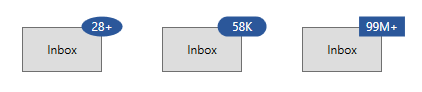
Badge notification severity
To indicate the severity or priority of a notification, the Badge control comes with built-in fill options. Based on the current theme and selected fill, the foreground and background of the badge will be updated.
<Button Content="Primary">
    <syncfusion:SfBadge.Badge>
        <syncfusion:SfBadge Content="28+"
                            Fill="Error"/>
    </syncfusion:SfBadge.Badge>
</Button>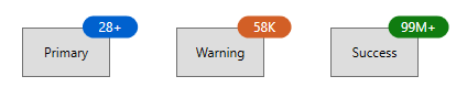
Badge animation
The Badge control’s content changes are visually indicated using animations. The control comes with scaling and transparent animations.
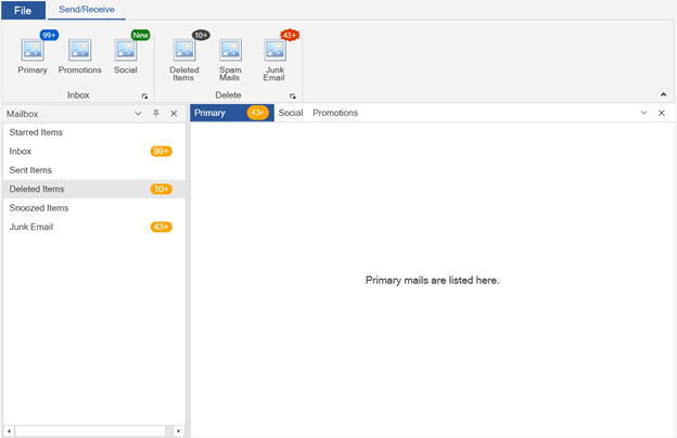
Integrated with controls
The Badge control can be attached to any UIElement, not just standard WPF controls. Let’s see how to show the Badge control in Ribbon and Docking Manager controls.
Integrate Badge with Ribbon control
The following code example integrates the Badge control with a Button control in the Ribbon control.
<syncfusion:RibbonButton
    SizeForm="Large"
    Label="Primary">
    <syncfusion:SfBadge.Badge>
        <syncfusion:SfBadge
            FontSize="10"
            Height="15"
            Width="26"
            Fill="Information"
            Shape="Oval"/>
    </syncfusion:SfBadge.Badge>
</syncfusion:RibbonButton>
Integrate with Docking Manager
The following code example integrates the Badge control to customize the header of the Docking Manager using HeaderTemplate.
<syncfusion:DockingManager
    UseDocumentContainer="True"
    x:Name="dockingManager" >
    <ContentControl
        syncfusion:DockingManager.Header="Primary"
        syncfusion:DockingManager.State="Document">
        <syncfusion:DockingManager.HeaderTemplate>
            <DataTemplate>
                <Border Width="100">
                    <TextBlock Text="{Binding}"
                                HorizontalAlignment="Left"/>
                    <syncfusion:SfBadge.Badge>
                        <syncfusion:SfBadge VerticalAlignment="Center"
                                            HorizontalAlignment="Right"
                                            FontSize="10"
                                            Padding="-20"
                                            Background="Orange"
                                            HorizontalAnchor="Inside"
                                            Content="43+"/>
                    </syncfusion:SfBadge.Badge>
                </Border>
            </DataTemplate>
        </syncfusion:DockingManager.HeaderTemplate>
        <TextBlock
            HorizontalAlignment="Center"
            VerticalAlignment="Center"
            FontSize="14">
            Primary mails are listed here.
        </TextBlock>
    </ContentControl>
</syncfusion:DockingManager>
Conclusion
I hope you now have a clear picture of the Syncfusion Badge control for WPF and all its customization features. You can learn more about it from its feature tour and user guide pages. You can also download examples of the control from this GitHub repository and try them out for yourself.
Syncfusion has over 90 essential WPF controls like a DataGrid, Charts, Diagram, and PDF Viewer. Give these controls a shot by downloading the setup from our latest release. Our demos are now available in Microsoft Store, and .NET Core demos are available in the App Center.
For existing customers, the newest version is available for download from the license and downloads page. If you are not yet a customer, you can try our 30-day free trial to check out these new features.
Also, if you wish to send us feedback or would like to submit any questions, please feel free to post them in the comments section of this blog post. You can also contact us through our support forums, feedback portal, or Direct-Trac support system.