TL;DR: Are you using Power BI for your business analytics needs? Integrating the Syncfusion JavaScript Gantt Chart elevates your data visualization and reporting workflows within Power BI apps. Streamline the integration process with easy-to-follow steps and explore diverse demos tailored for various platforms.
Visuals are paramount in data analysis, and Power BI empowers users to craft custom visuals for more impactful data representation. It allows users to visualize and analyze data from various sources, helping organizations make informed decisions.
Syncfusion JavaScript Gantt Chart is a project planning and management tool. It provides a Microsoft Project-like interface to display and manage hierarchical tasks with timeline details. Its intuitive user interface lets you visually manage tasks, resources, and task relationships in a project.
In this blog, we’ll see how to integrate JavaScript Gantt Chart into your Power BI app to boost data visualization.
Why choose Syncfusion JavaScript Gantt Chart?
Syncfusion JavaScript Gantt Chart offers a comprehensive set of features for project management, including:
- Task scheduling: Easily schedule tasks and manage project timelines.
- Resource management: Assign and track resources efficiently.
- Task dependency: Establish dependencies between tasks for accurate scheduling.
- Interactive editing: Edit tasks interactively with drag-and-drop support.
- Customization: Customize the appearance and behavior of the Gantt Chart to suit your needs.
Prerequisites
Before diving into the integration process, ensure you have the following prerequisites set up:
- Compatible versions of Power BI are installed on your machine.
- Node.js (latest version)
- Windows PowerShell (Version 4 or newer)
- Visual Studio Code for editing
Create a Power BI application
Follow these steps to create a Power BI app seamlessly:
- First, install the Power BI Visuals Tools globally using the following command. This command ensures you have the tools to develop custom visuals within the Power BI.
npm i -g powerbi-visuals-tools
- To ensure secure communication, install the SSL certificate using the following command. This step is crucial for establishing secure connections during development.
pbiviz install-cert
- Then, use the following command to create your new custom visual project with the preferred project name.
pbiviz new <ProjectName>
This command initializes a new custom visual project within Power BI, allowing you to start building and customizing visuals such as Gantt Charts according to your requirements.
Integrating Syncfusion JavaScript Gantt Chart into Power BI
Follow these steps to seamlessly add the Syncfusion JavaScript Gantt Chart to the Power BI app:
- Ensure you have installed the Syncfusion Gantt package in your project. Use npm or yarn to install it.
npm install @syncfusion/ej2-gantt --save
- In your visual.ts file, import the Gantt module and render the Gantt chart. For detailed guidance, refer to Syncfusion’s documentation.
import { Gantt } from '@syncfusion/ej2-gantt';

export class Visual implements IVisual {
    constructor(options: VisualConstructorOptions) {
        this.target = options.element;

        // Create a new div element.
        const ganttContainer: HTMLElement = document.createElement('div');
        ganttContainer.setAttribute('id', 'ganttContainer');
        this.target.appendChild(ganttContainer);

        // Render Gantt Chart.
        let gantt = new Gantt({
            dataSource: yourDataSource,
            taskFields: {
                // Define task fields here
            },
            // Other Gantt properties and configurations.
        });
        gantt.appendTo('#ganttContainer');
    }
}
- Now, define your data source with the necessary fields required for the JavaScript Gantt Chart.
let yourDataSource = [
    // Your data source here.
];
- Let’s customize the appearance and behavior of the Gantt Chart by configuring its properties.
let gantt = new Gantt({
     // Other configurations...
     columns: [
            // Define Gantt columns here.
     ],
     labelSettings: {
            // Configure label settings here.
     },
     // Other Gantt properties...
});
- Then, execute the following command to run the project.
pbiviz start
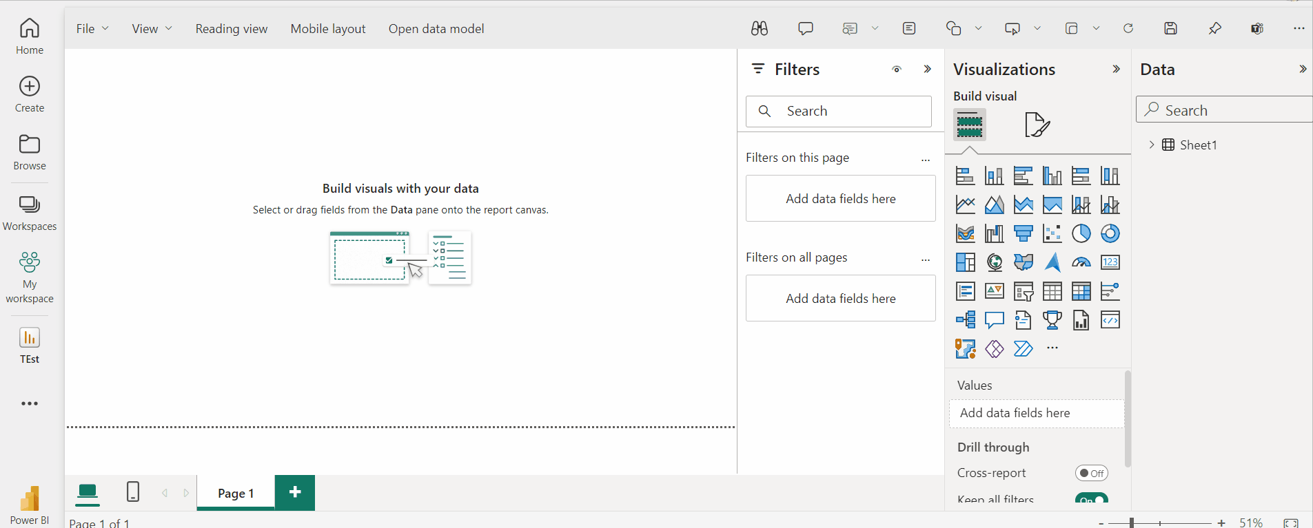
- Now, test your visual in the Power BI service. Open a new or existing Power BI report (app.powerbi.com) and select the Developer Visual from the Visualizations pane.
Refer to the following image.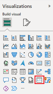

Now, you can see the Syncfusion JavaScript Gantt Chart in the Power BI application.
Note: If you do not see this visual, enable the custom visual debugging settings.
GitHub reference
For more details, refer to integrating the JavaScript Gantt Chart in the Power BI demo on GitHub.
Conclusion
Thanks for reading! In this blog, we’ve seen how to integrate Syncfusion JavaScript Gantt Chart into your Power BI app. With this, you can create interactive Gantt charts to visualize project timelines and manage tasks efficiently. Discover the complete capabilities of our Gantt Chart and take your Power BI reports to new heights!
We also provide the Gantt Chart component across various platforms. Explore the Gantt Chart demos for different platforms below:
- TypeScript Gantt Chart
- JavaScript Gantt Chart
- Angular Gantt Chart
- React Gantt Chart
- Vue Gantt Chart
- ASP.NET MVC Gantt Chart
- ASP.NET Core Gantt Chart
The new version of Essential Studio is available for existing customers on the License and Downloads page. If you’re not a Syncfusion customer, sign up for our 30-day free trial to explore our features.
If you have any questions, you can reach us through our support forum, support portal, or feedback portal. We’re always here to assist you!
Related blogs
- Start Using the npm Query Today: Powerful Commands for Every Developer
- Top Linters for JavaScript and TypeScript: Simplifying Code Quality Management
- 7 JavaScript Unit Test Frameworks Every Developer Should Know
- Understanding CommonJS vs. ES Modules in JavaScript
- Using Microsoft Project Files with Syncfusion JavaScript Gantt Chart