The Essential JS 2 button component is an advanced version of an HTML button. It is the best alternative for an HTML button since it has all the core functionalities of an HTML button plus advanced features such as different types and predefined styles that are adaptable to different application environments.
The Essential JS 2 button can contain text, icons, or both. The button can also be used to communicate with users through colors, shapes, and images without any text. For example, a button with an image of a magnifying glass almost always represents a search option. A green button almost always represents a successful action, such as a GitHub merge.
This blog post will provide an overview of the Essential JS 2 button, how to configure it, and how to use its advanced features.
Getting started
You need to set up the development environment before creating a button. It is very easy to get started with the button since its source code is available in GitHub and packages are available in npm.
To get started with the button component, you can clone the Essential JS 2 quick-start project using the following commands.
git clone https://github.com/syncfusion/ej2-quickstart.git quickstart
cd quickstart
npm install
The project is preconfigured with common settings (i.e. src/styles/styles.css and system.config.js files) for starting all the Essential JS 2 components.
Configuring the button
Now all configuration related to the environment is completed. Next, we need to configure the button in an application. Add the HTML button tag with an id attribute set as element to your index.html file.
<!DOCTYPE html>
<html lang="en">
<head>
    <title>Essential JS 2</title>
    <meta charset="utf-8" />
    <meta name="viewport" content="width=device-width, initial-scale=1.0, user-scalable=no" />
    <meta name="description" content="Essential JS 2" />
    <meta name="author" content="Syncfusion" />
    <link rel="shortcut icon" href="resources/favicon.ico" />
    <link href="https://maxcdn.bootstrapcdn.com/bootstrap/3.3.7/css/bootstrap.min.css" rel="stylesheet" />
    <!--style reference from node_modules/@syncfusion/ej2/-->
    <link href="/styles/styles.css" rel="stylesheet" />
    <script src="node_modules/systemjs/dist/system.src.js" type="text/javascript"></script>
    <script src="system.config.js" type="text/javascript"></script>
</head>
<body>
    <div>
        <!--Element that is going to be rendered-->
        <button id="element">Button</button>
    </div>
</body>
</html>
Now let’s initialize the button component in your app.ts file and append it to #element as shown in following code example.
import { Button } from '@syncfusion/ej2-buttons';

// Initialize button component.
let button: Button = new Button();

// Render initialized button.
button.appendTo('#element');
npm startRun the application in the browser using the previous command to render the button. It should appear as follows.
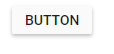
Button component
Themes give components a look and feel that fits the application environment. The Essential JS 2 button supports the following themes:
- Material
- Office 365
- Bootstrap
- High contrast
In this demo application, the Material theme will be used for the button.
Defining button styles
The button has a predefined set of styles. Each style serves its own purpose. You can style the button by simply adding a class name through its interface. For this demo we are going to create several buttons and style them through classes.
<button id="primarybtn">Primary</button>
<button id="successbtn">Success</button>
<button id="infobtn">Info</button>
<button id="warningbtn">Warning</button>
<button id="dangerbtn">Danger</button>
<button id="linkbtn">Link</button>
import { Button } from '@syncfusion/ej2-buttons';
//Primary Button - Used to represent a primary action.
let button: Button = new Button({ cssClass: `e-primary`}, '#primarybtn');
//Success Button - Used to represent a positive action.
button = new Button({ cssClass: `e-success`}, '#successbtn');
//Info Button - Used to represent an informative action.
button = new Button({ cssClass: `e-info`}, '#infobtn');
//Warning Button - Used to represent an action with caution.
button = new Button({ cssClass: `e-warning`}, '#warningbtn');
//Danger Button - Used to represent a negative action.
button = new Button({ cssClass: `e-danger`}, '#dangerbtn');
//Link Button - Changes the appearance of the Button like a hyperlink.
button = new Button({ cssClass: `e-link`}, '#linkbtn');
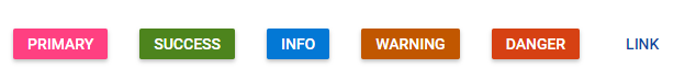
Button components with styles
Creating an icon button
Users tend to perceive visual information better than text. The button can include an icon to add a visual representation of its action. Icons can be added to buttons through their interface. You can customize the icon position to either the left or right side of the button. Icon-only buttons are also supported. In this demo we are going to create a button and load it with different icons.
<style>
 /*For stop icon button*/
        .e-stop-icon::before {
            content: '\e790';
        }
        /*For play icon button*/
        .e-play-icon::before {
            content: '\e798';
        }
        /*For open icon button*/
        .e-open-icon::before {
            content: '\e782';
        }
</style>
<button id= 'iconbutton'></button>
<button id= 'iconleftbtn'>Play</button>
<button id= 'iconrightbtn'>Stop</button>
import { Button } from '@syncfusion/ej2-buttons';

let button: Button = new Button({iconCss: 'e-icons e-open-icon'}, '#iconbutton');

button = new Button({iconCss: 'e-icons e-play-icon', iconPosition: 'Right'}, '#iconleftbtn');

button = new Button({iconCss: 'e-icons e-stop-icon'}, '#iconrightbtn');
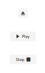
Icon-only button (top), button with icon on left (center), button with icon on right (bottom)
Customization
Buttons also have options for customizing their size, shape, and functionalities:
- A button’s shape can be customized as a round button, block button, or outline button.
- Two different sizes are available.
- A button can be extended as a toggle button or repeat button by handling event handlers.
In this demo we are going to create different buttons and customize their CSS.
<style>
/*For round add icon button*/
		.e-add:before {
            content: '\e823';
        }
        .block {
            margin: 40px 0px;
        }
        .block button {
            margin-right: 15px;
        }
</style>
<div class="block">
            <div class="col-xs-6 col-sm-4 col-lg-4 col-md-4 ">
                <div class="block">
                    <button id='outlinebtn'></button>
                </div>
                <div class="block">
                    <button id='roundbtn'></button>
                </div>
            </div>
            <div class="col-xs-6 col-sm-4 col-lg-4 col-md-4 ">
                <div class="block">
                    <button id='smallbtn'>Small</button>
                </div>
                <div class="block">
                    <button id='normalbtn'>Normal</button>
                </div>
            </div>
            <div class="col-xs-12 col-sm-4 col-lg-4 col-md-4 ">
                <div class="block">
                    <button id="blockbtn">Block Button</button>
                </div>
                <div class="block">
                    <button id="primaryblockbtn">Block Button</button>
                </div>
            </div>
</div>
import { Button } from '@syncfusion/ej2-buttons';
let button: Button =new Button({cssClass:'e-outline e-primary', content: 'outline'}, '#outlinebtn');
button = new Button({cssClass:'e-round e-primary', iconCss: 'e-icons e-add'}, '#roundbtn');
button = new Button({cssClass: `e-block`});
button.appendTo('#blockbtn');
button = new Button({ isPrimary: true, cssClass: `e-block` });
button.appendTo('#primaryblockbtn');
button = new Button({ cssClass: `e-small`}, '#smallbtn');
button = new Button();
button.appendTo('#normalbtn');
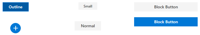
Buttons with different shapes, sizes, and behaviors
Conclusion
In this blog, we have looked at how to create a simple button, change its style, and customize its UI and behavior through its properties and CSS. You can download the button sample on GitHub that has been prepared for this blog.
Feel free to view our interactive samples and documentation to explore the other features of the button. If you have any questions or require clarification, please let us know in the comments section below. You can also contact us through our support forum or Direct-Trac. We are happy to assist you!